Algolia’s onboarding process is detailed, although at times confusing. But it does a good job of amplifying its value while guiding you through a complex onboarding flow.
Rating: 8/10
Intro
As part of our unboxing series, I’ll be taking a close look at Algolia’s onboarding. If you aren’t familiar with Algolia, they are a major player in the backend search space. Specifically, Algolia enables businesses to efficiently surface search results to users by better indexing their content.
While Algolia is primarily an enterprise product, it remains a leader in the self-serve search space. A solid onboarding experience is important for future Algolia users to get set up without needing a human.
Please remember that any criticism in this teardown is not a review of the core Algolia product. I am an Algolia user and love their product; it only follows that the Algolia app deserves a stellar onboarding experience to enable newer users. While criticizing some app friction can come off as whiny (”Oh no, they made me click a button!”), it comes from an undeniable fact: today’s business professionals are heavily distracted by internet doo-dahs. As a result, all SaaS apps should strive to perfect their set-up processes.
Step 1: The homepage
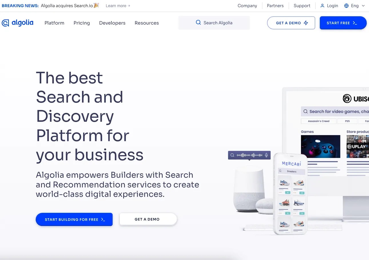
Like all products, I’ll start on the homepage to begin the sign-up.
What there is to love:
- The call to action is sufficiently called out in blue.
- Algolia clarifies from the get-go that they have some sort of free offering, though it’s unclear if it is a free trial or a free tier.
Step 2: The get started form
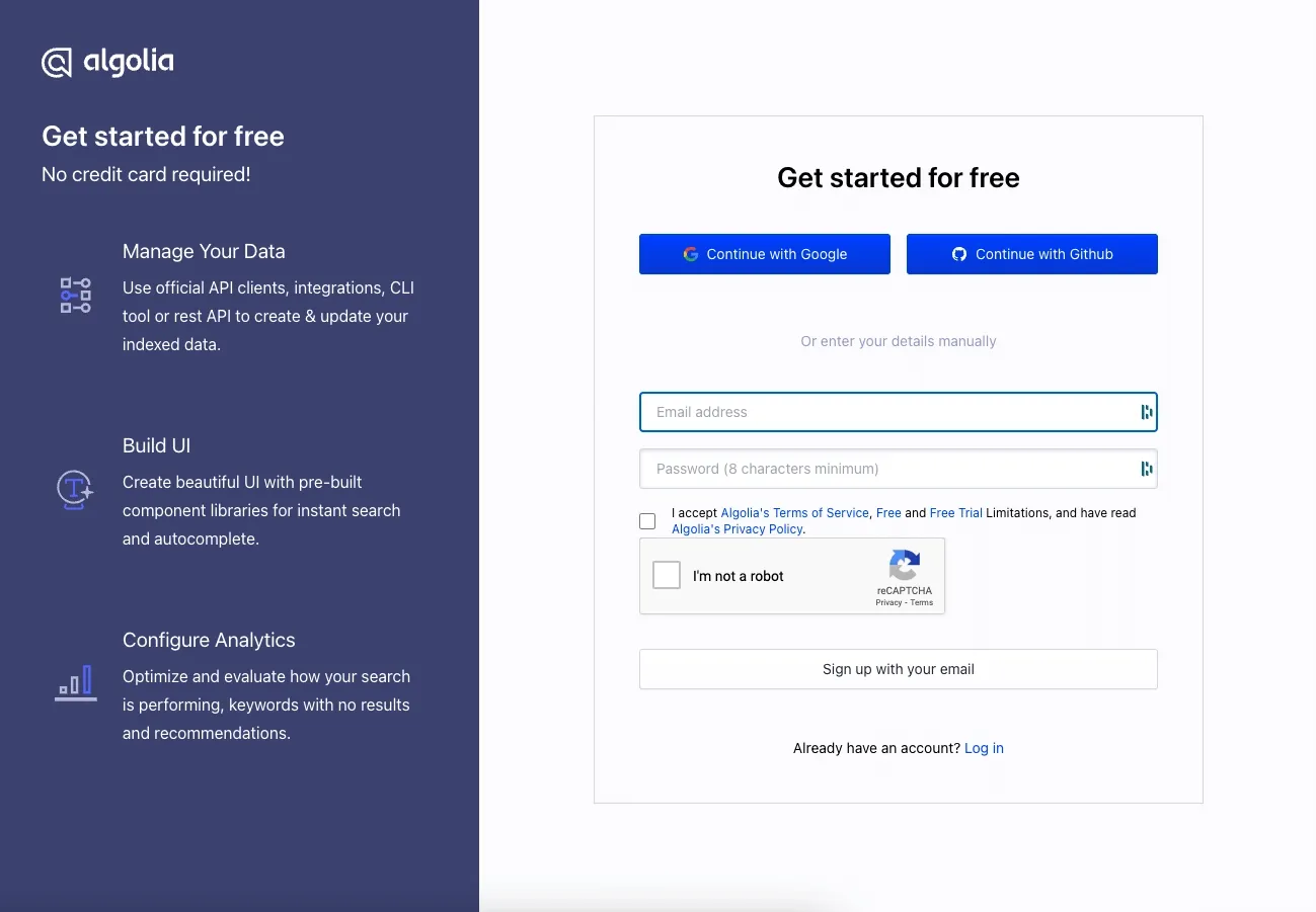
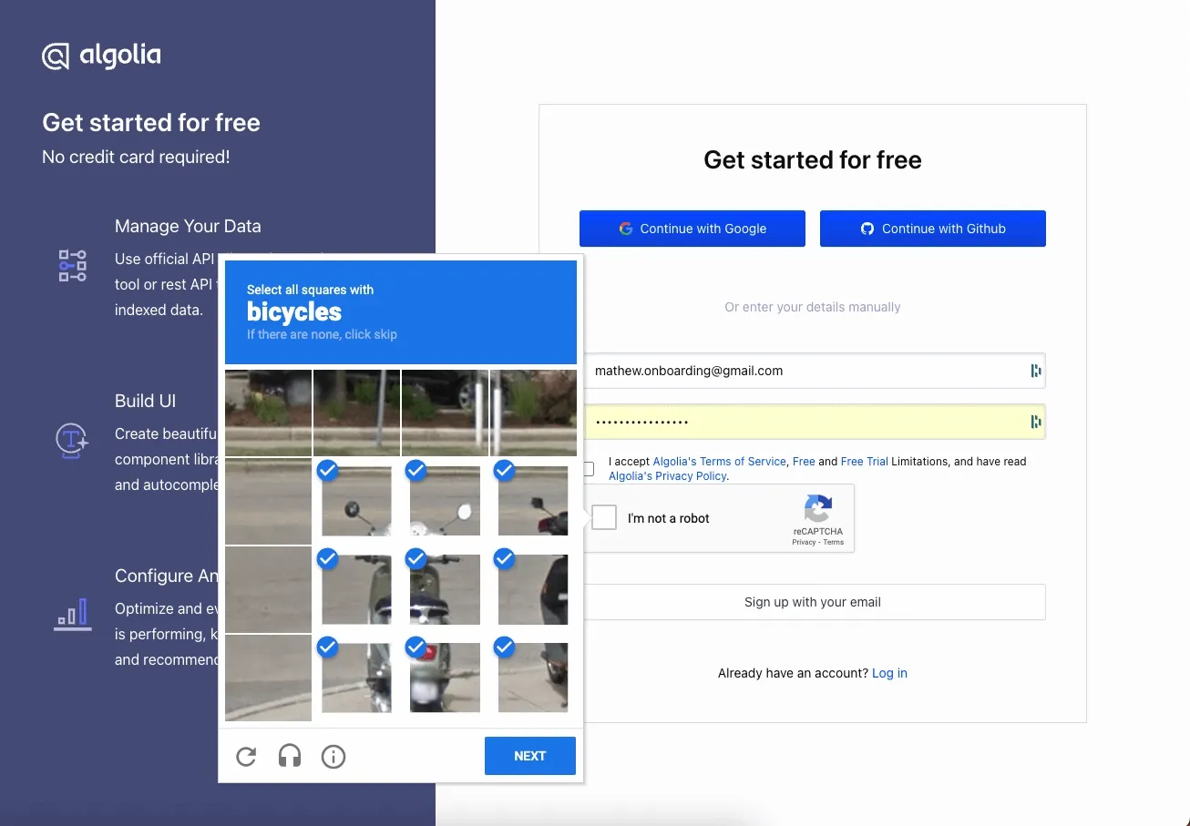
After signing up, I encountered a get started form. While the reCAPTCHA is poorly padded, this is a good page.
What there is to love:
- The OAuth options are clearly available with logo icons for each provider.
- A good summary of what’s specifically available in the free tier from the lefthand column. This helps manage my expectations.
- The form is short and not intimidating. The password rules are straightforward.
The reCAPTCHA experience is simple and easy to do:
Step 3: Welcome to Algolia
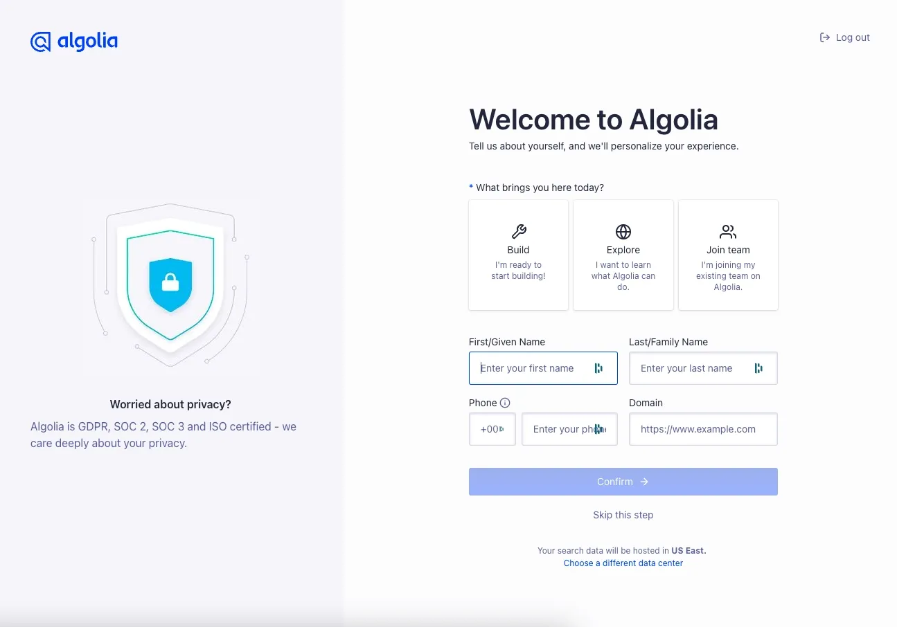
After filling out the form, I’m greeted with a choice of what to do. This is also an excellent page.
What there is to love:
- The copy is short and easy to parse. Although 'Domain' seems inadequately explained in the context of providing otherwise personal information.
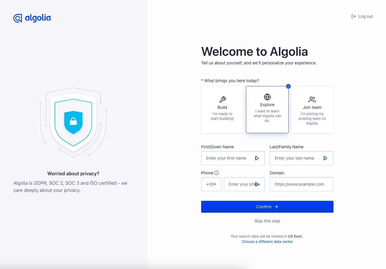
- Icons guide how to answer the first question, which personalizes the onboarding experience.
- I am given the option to skip this step. This is exceptionally rare and requires more engineering effort, but being able to skip onboarding to explore the app satisfies the most eager of users.
- I am assuaged about security, presumably one of Algolia’s biggest objections, via the self-point on the left-hand side.
I decide on Explore, which matches my current interests in signing up from Algolia.
Step 7: The main app
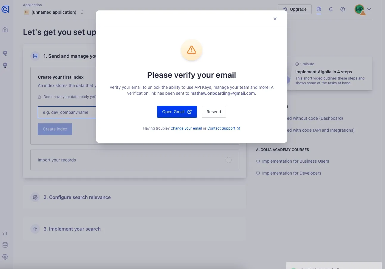
I am now in what appears to be Algolia’s main app. I am immediately confronted by a pop-up asking me to verify my email. While we're typically pretty anti pop-up around here, this acceptable.
What there is to love:
- I am able to dismiss the pop-up if I want to explore it before verifying
- I am able to open Gmail, parsed from my email, in a new tab with a single click. Incredible!
- I am able to request a new email if I believe the last one got quarantined.
- I am given clear notice of what I can’t do if I don’t verify my email.
Email verification is never an exciting part of onboarding—but Algolia at least makes it easy. This is one of the best email verification steps I’ve seen.
Step 8: Email Verified
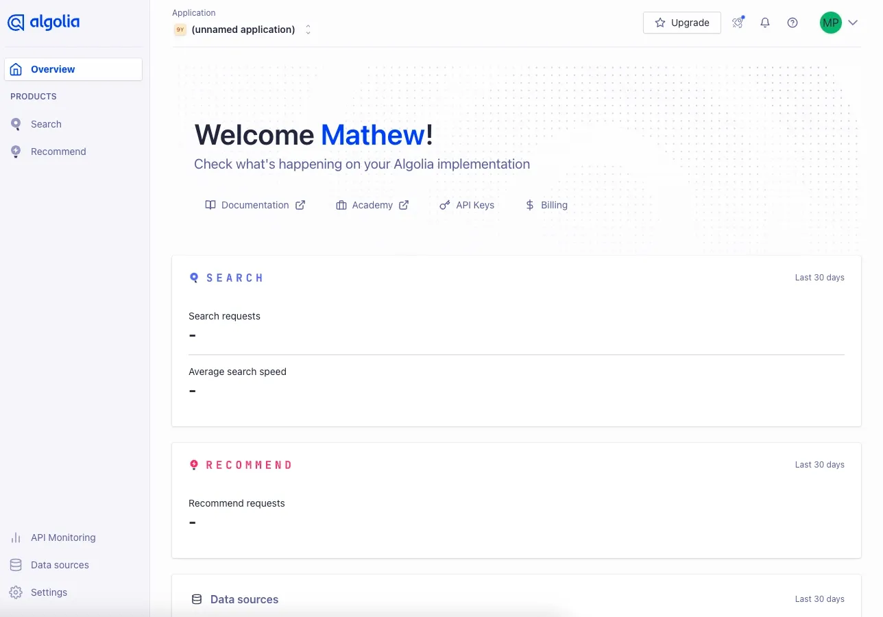
After navigating to my email and clicking the button to verify, a new tab opens with a Welcome message.
What there is to worry about:
- This tab didn’t open to the Algolia set-up experience. That’s only available on the previous tab, which is confusing.
- Beyond clicking into Documentation, it’s unclear what to do with this page.
Step 9: Returning to the Original Tab
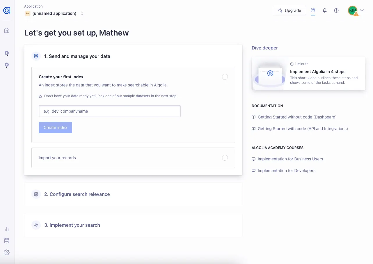
I return to the original tab to continue with the onboarding flow. This is a nice UI.
What there is to love:
- I can access an informational video with a clearly stated duration from within the application.
- I can access relevant sub-pages in the Documentation from within the application.
- I clearly understand how many steps (3) this set-up flow will take.
What there is to worry about:
- I don’t know what I should name my index. It’s not clear, even with the suggested text, what the index should be named. After a data set? Anything arbitrary? A better tooltip here would be appreciated.
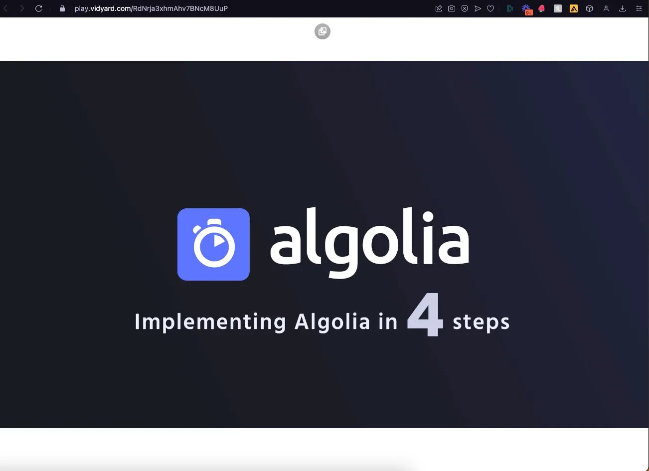
- When I click the video, it opens a new tab with a full-screen video using Vidyard. One of the reasons Command AI supports in-app videos is that the experience of watching, dismissing, and returning to the product involves a lot less interaction friction.
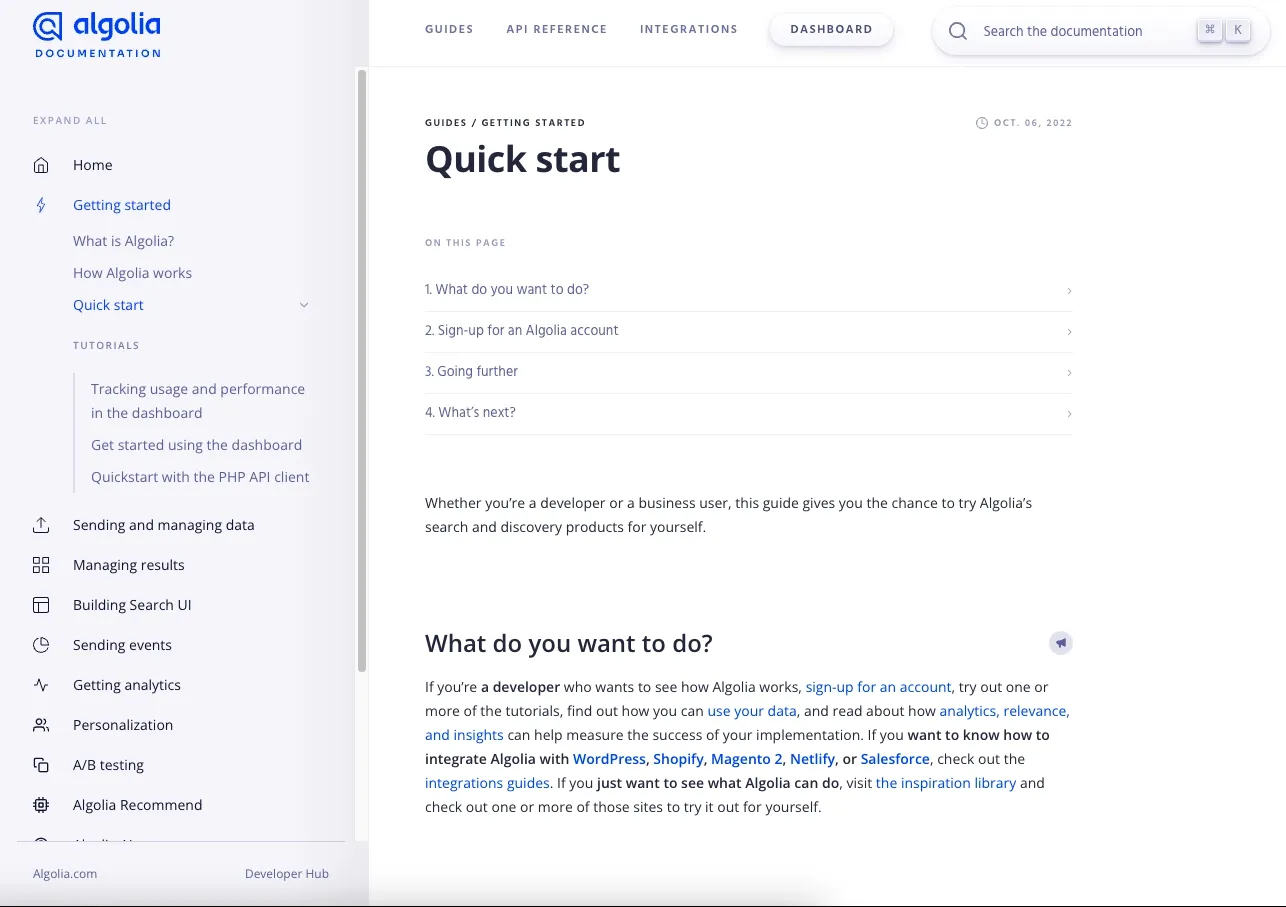
When clicking on the documentation, the page is nicely organized and structured.
Returning to the application set-up screen, I enter “elixiverse” for my fictional data set.
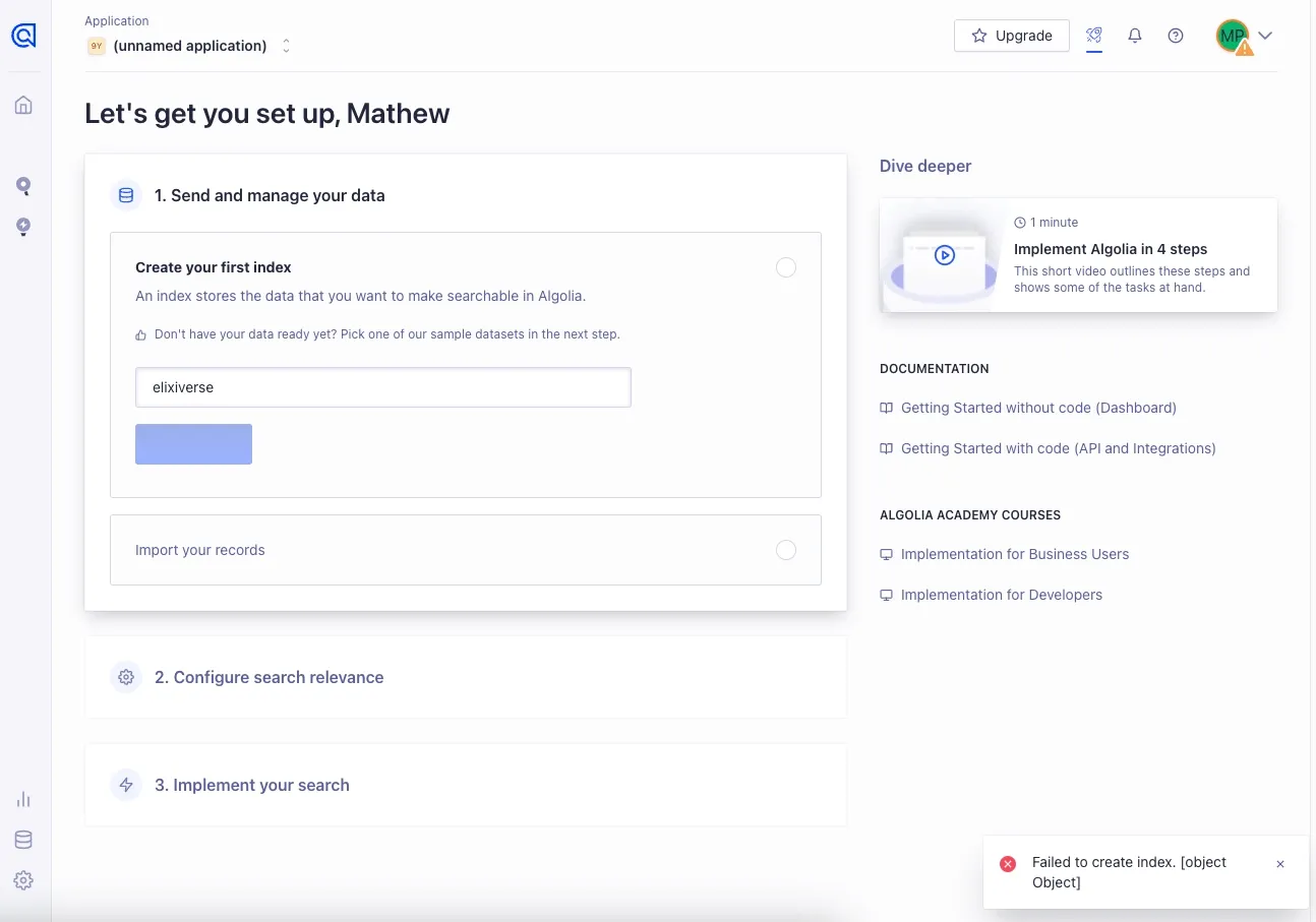
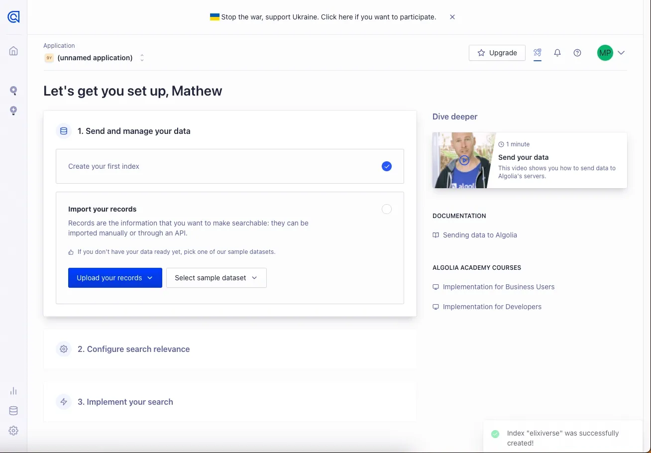
After clicking the CTA, I am greeted by the next subset to import my records.
What there is to love:
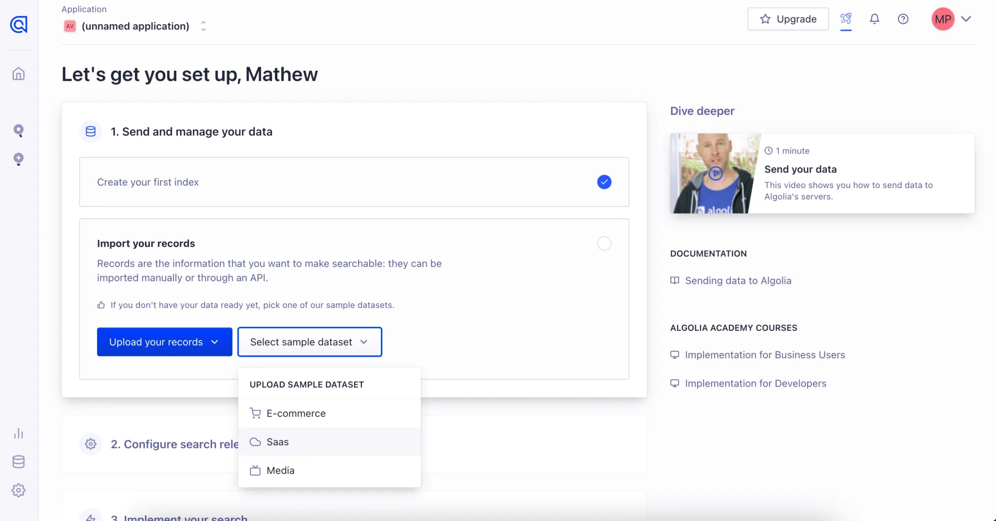
- I can import a sample dataset if I don’t have my records available. This minimizes the odds I need to halt onboarding to ping a teammate.
- Clear, informative, and brief copy of what importing records does.
I choose SaaS from the sample dataset options.
Step 10: Configuring Search Results
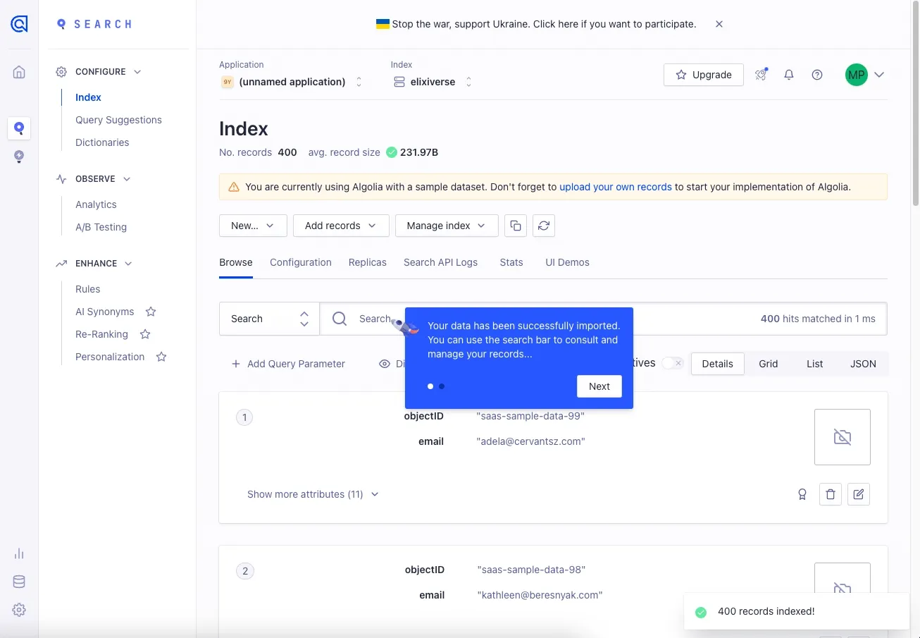
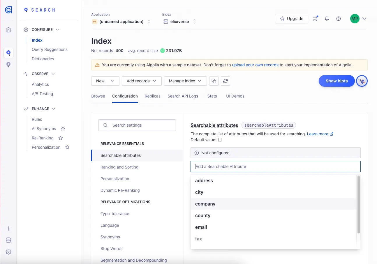
Surprisingly, clicking on a sample data set exits the previous view—apparently, the step-by-step UI was to represent the process! Now, I am in the thick of Algolia’s product, which is very complex. However, the onboarding clearly isn’t finished.
What there is to love:
- A clear, blue tooltip surfaces. It utilizes dots to indicate how many sub-steps it hosts.
- The tooltip doesn’t obfuscate the app.
However, ideally, the tooltip would have a clear button to dismiss it if I don’t find it helpful. Some users abhor tooltips, period—they should have a clearly marked button to close them.
As I explore the product, more tooltips guide me.
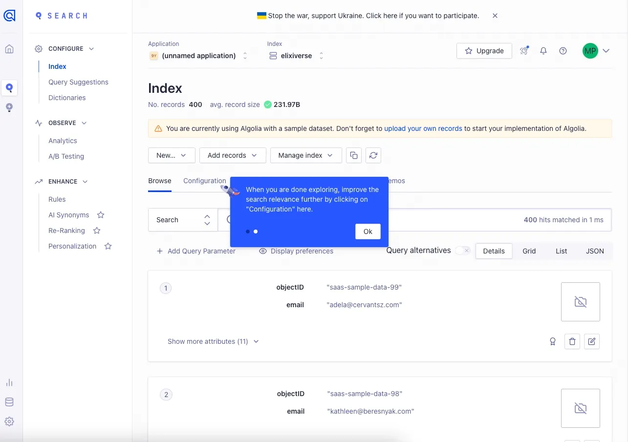
After completing the tooltips, there is a very visible ‘Show hints’ button and icon available for me to see the tooltips again. That’s a fantastic way to keep the tooltips around without flooding the UI with tooltip hover icons.
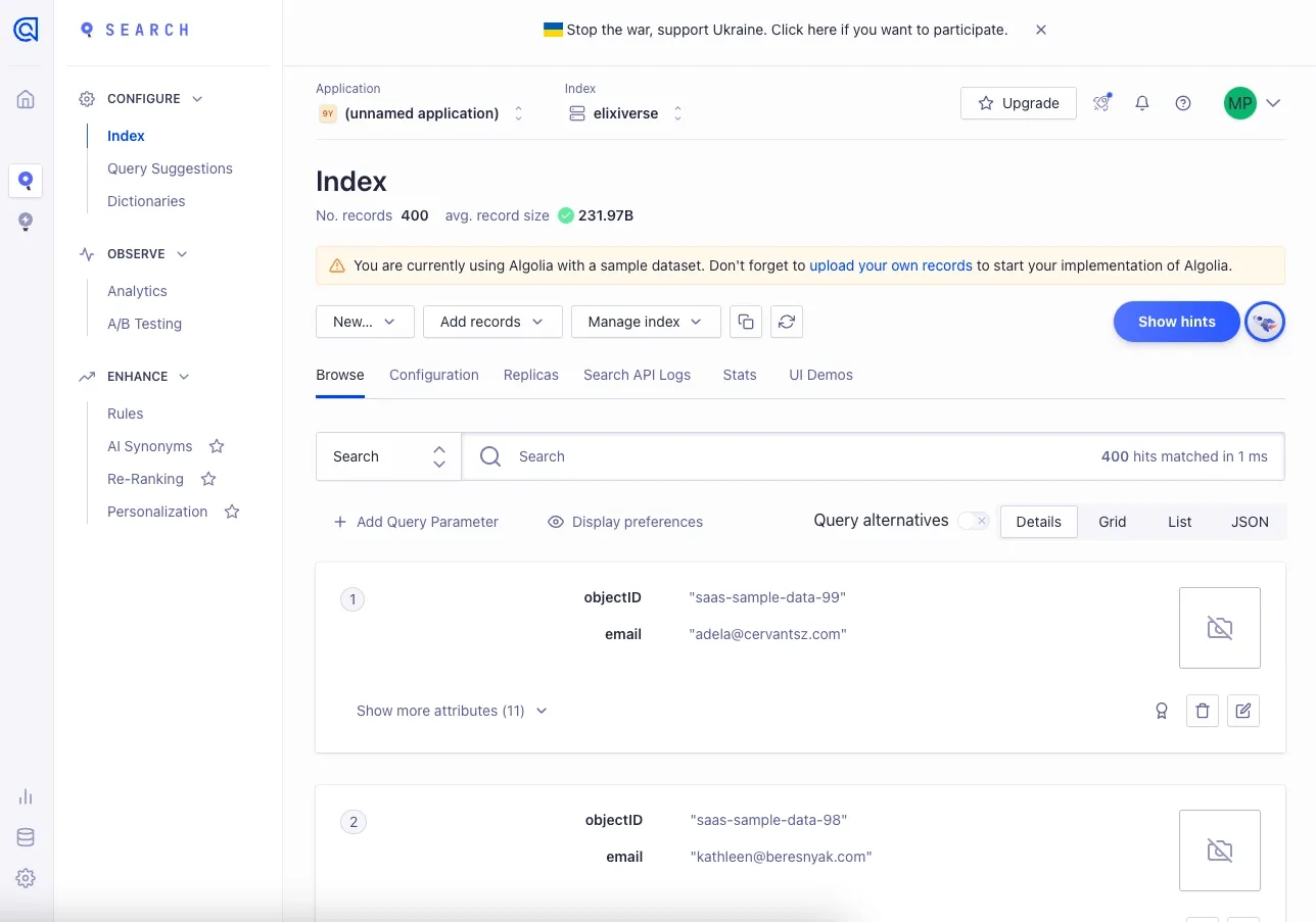
Upon clicking it, I can see tooltips on any subview that I have presently focused.
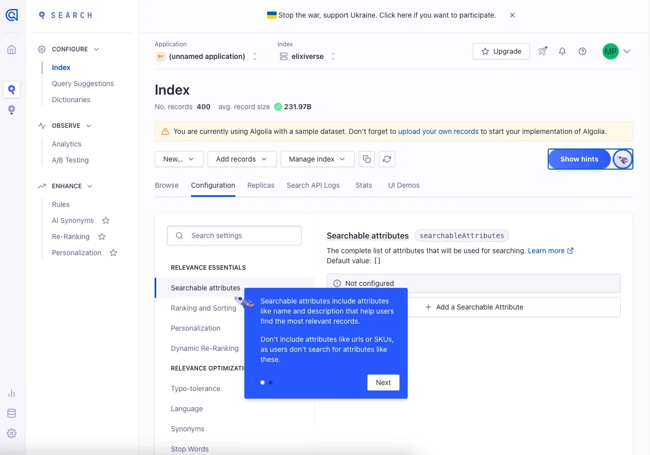
The tooltip size morphs and changes relative to the amount of content. This minimizes how much it obfuscates the UI. Excellent.
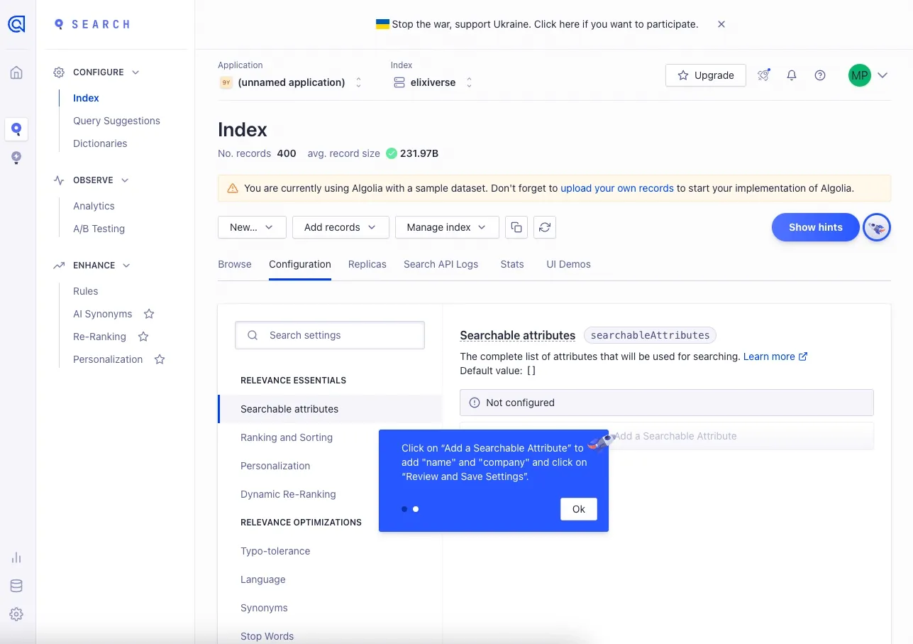
After I dismiss the tooltips, I feel like I am in a good place to explore the app.
Step 11: Checking out the Algolia Recommend product
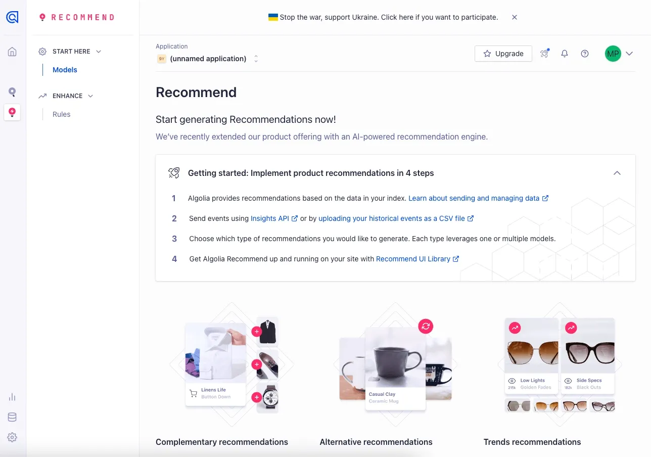
Algolia has two primary products, the flagship being Search and the other being Recommend. Upon opening the Recommend product from the sidebar, I am greeted with a new onboarding UI.
What there is to love:
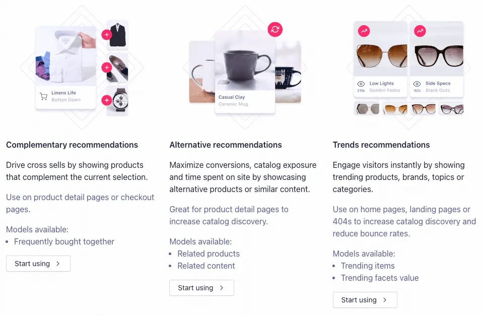
- I have clear options for the different things that Recommend can do. I can personalize my experience of what I want to discover.
- There are clear sign-posted links of what sub-pages in the Documentation Portal are worth checking out.
Highlights
There were several highlights where Algolia’s onboarding process shined. These include:
- Making it easy to verify my email with minimal friction.
- The ability to personalize my onboarding experience to suit my use case for Algolia.
- Easy access to documentation, including brief, simple videos.
Lowlights
There were a few minor negative moments
- A better video UI that doesn’t detour me from the app. In-app video is preferred.
- Some confusion regarding Algolia’s terminology and jargon.
Verdict: 8/10
Algolia’s onboarding process is detailed with occasional cognitive friction but a streamlined, step-by-step flow. I am able to get into the product quickly. Their tooltips helped me understand what the various components of the product do.
While there is some room for improvement, the Algolia onboarding experience amplifies, not hinders, access to the Algolia search product.
For more examples, check out these actually useful user onboarding experiences, or take a look at unboxings of PostHog and Vercel.
