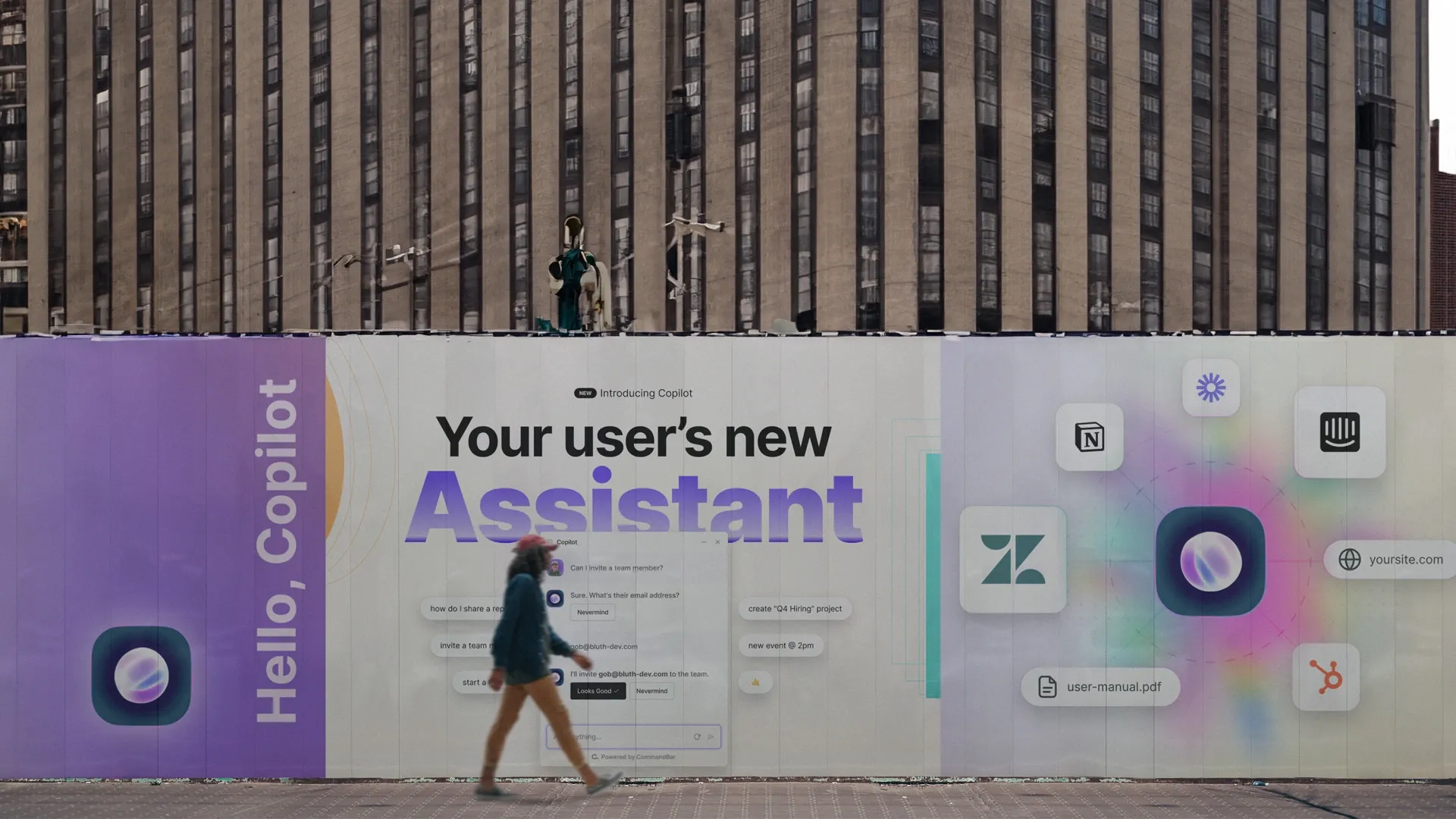
No time to read? Get our free cheat sheet with the SaaS onboarding best practices by clicking here. (Hit 'request' and you'll get access ASAP).
Being product-led sounds awesome: No need for salespeople, just build a great product and the ARR rolls in on autopilot.
But with that upside comes a downside: Because you don't have humans holding the user's hand, you need to build stellar self-serve onboarding. In this article, you'll find out the best strategies to create onboarding experiences that activate and engage new users.
As more and more SaaS products enter the market, a good onboarding experience has become paramount to standing out from the crowd. Products with poor onboarding experiences suffer from high churn rates and poor long-term growth.
Unfortunately, some onboarding practices such as product tours and onboarding checklists have been over-used and poorly implemented by many products. As a consequence, it has become harder and harder to create a compelling user onboarding strategy that actually reduces churn. Poor onboarding can also become a nuisance to the customer support team that may spend too much time answering product questions that might otherwise be obvious with the right onboarding strategies.
During this article, we’ll discuss various SaaS onboarding practices and which methods are top-tier at actually onboarding users.
What is SaaS Onboarding?
SaaS onboarding is the process through which users are introduced to a product and successfully adopt it. Good SaaS onboarding strategies expose users to core functionality so that users understand a product’s value and what problems that product solves. Common onboarding strategies used by SaaS companies include product tours, task checklists, progress meters, tooltips, and nudges.
While onboarding is often associated with the immediate steps after a user signs up for a product, onboarding can extend into weeks or months, during which a user gets accustomed to the product. SaaS products are often used by businesses; tangentially, a product’s user may not have been involved with the decision to purchase the product or sign up for a product without any understanding of how it should work.
Special things to consider when designing a SaaS onboarding strategy include:
- An average user’s background knowledge when using the product for the first time
- Any features that are counter-intuitive in how they work
- Any features or pages that experience high session drop-off rates
- Any feature or page that acts as a precursor before routine and healthy user interaction; that 'aha' moment that invigorates users
- Any existing knowledge base’s range, and how available is that knowledge base to an average user
- An average user’s typical willingness to learn the product
One of the biggest takeaways from this article will be the difference between the push and pull approach to onboarding. Push strategies—things like product tours or nudges—weakly or strongly interrupt a user’s workflow to point them towards or inform them about a feature. Pull strategies—things like a Command AI or a Learn More tooltip—require user input to be activated but don’t interrupt a user’s flow.
User Onboarding Best Practices
- Use customer success (humans) when possible: When possible, have a person onboard your user. While impractical for some companies, human-driven onboarding will collect fantastic insights and build the best relationships with customers.
- Replace complex UI patterns with familiar UI patterns: Don’t reinvent the wheel. Using common UI patterns will help users grasp your product faster than spending time deciphering your UI.
- Keep users in-app: Changing tabs and domains leads to more distractions and poorer usage. Keep your onboarding efforts within your product.
- Use product tours (with consent): Product tours have a dirty name because they are often over-used and fired without user consent. Ask a user if they want a product tour, and if so, provide them with one.
- Use search-based onboarding: Encourage your users to search for their problems and surface the results of that search within your product, not externally.
- Use tooltips on non-obvious features: Utilize tooltips to explain features that aren’t already obvious. When using tooltips, keep them discrete to avoid them busying your interface.
- Use context-driven nudges: Nudges, notification-like widgets, are shown to users when they are contextually important. Nudges are a great push strategy that isn’t invasive.
- Track user onboarding flows: You cannot build a strong user onboarding strategy if you don’t know what feature education you are trying to optimize for. Good user analytics will help inform your user onboarding strategy.

Use customer success (humans) when possible
The most sure-fire (but expensive) SaaS customer onboarding strategy is for customer success to manually onboard a user over a Zoom call. Unlike code or computers, humans are able to adapt their assistance based on a user’s voiced or perceptible needs. Customer success can also better study how users are or aren’t struggling with a product and offer the best insight.
Obviously, this strategy is a no-go for many companies. For most self-serve, low ACV products, users need to be onboarded via an automated system—it is both impractical and unlikely for users to book onboarding calls with customer success. However, for high-ticket items, a kick-off call and even a 1-on-1 call with customer success are likely in order.
Replace complex UI patterns with familiar UI patterns
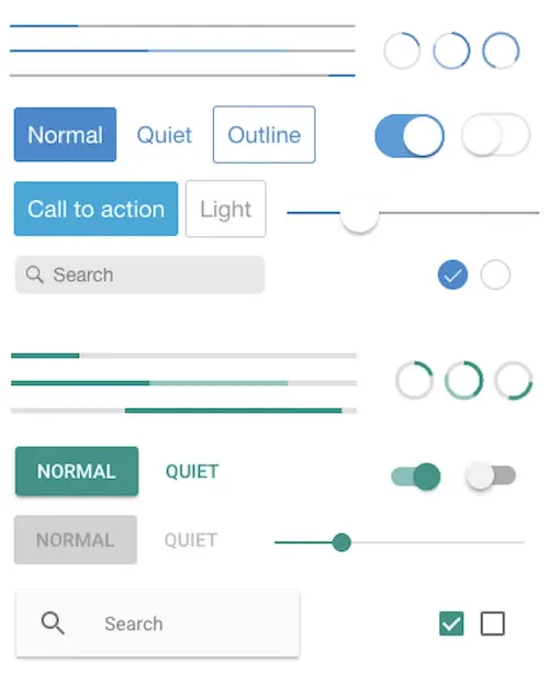
A long time ago, a unique user interface might’ve been conflated with good design. However, users nowadays spend more time on other products than any one arbitrary tool. As a result, it is important that your user interface design matches other design patterns found across the web.
By utilizing common design patterns like accordions, buttons, common icons, and light boxes, you will see better immediate user onboarding without the influence of any additional tooling. While additional tooling is likely necessary to achieve good onboarding for all users, familiar UI design will create a better base of what features require extra onboarding effort.
Keep users in-app
While building a product university or help center may be tempting, it is important to remember that the Internet is distracting. Users should be encouraged to solve their user onboarding problems in-app—not on YouTube or the company’s help center. That doesn’t mean that a help center or video content isn’t helpful. Rather, that content should be accessible in-app, either through a powerful search bar (like Command AI) or external links mounted next to the respective help-worthy features.
Keeping users in-app will pay dividends in encouraging daily and weekly active use. If users believe that using your product will take time due to a back-and-forth between the help content and the actual product, they are less likely to return. Conversely, if users believe they can solve any problems quickly from within the product itself, they’ll perceive the product as easier to pick up and learn. Everybody likes to solve problems, but nobody likes to juggle tabs.
Use product tours (with consent)
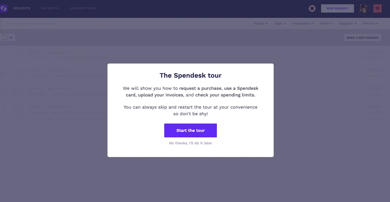
Product tours can be a mixed bag. Product tours, those pop-up, step-by-step tours after signing in to a product for the first time, have become ubiquitous. Initially, they were a fantastic way to showcase a product’s entire surface in a sequential, informative format. Unfortunately, product tours are often dismissed for two reasons: they are perceived to be unnecessary coddling or unnecessarily long. I say perceived because users dismiss product tours not necessarily because your tour itself was bad but because previous experiences with tours that were too long or not helpful have poisoned their expectations for future tours.
That doesn’t mean that product tours are a dead strategy. Instead, after a user signs up, give them a choice—take the tour or self-serve the product themselves. Additionally, inform them how they could access the tour if they decide to take it later. This helps for two reasons. First, users are more likely to take the tour if it feels less like an interruption and more like a choice. Second, users are compelled to find the tour if they decide that their self-service choice wasn’t effective.
Use search-based onboarding
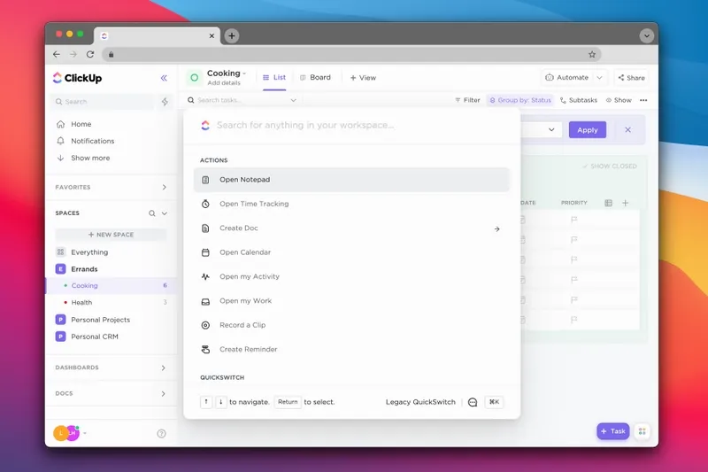
Search bars have existed since the dawn of the internet and are used on a daily basis (*cough* Google *cough*). The benefit of search bars is they are a user-led technique of getting something done, typically getting information about a particular thing. By including a search bar in your application, you can help users find relevant actions and documents on their own terms.
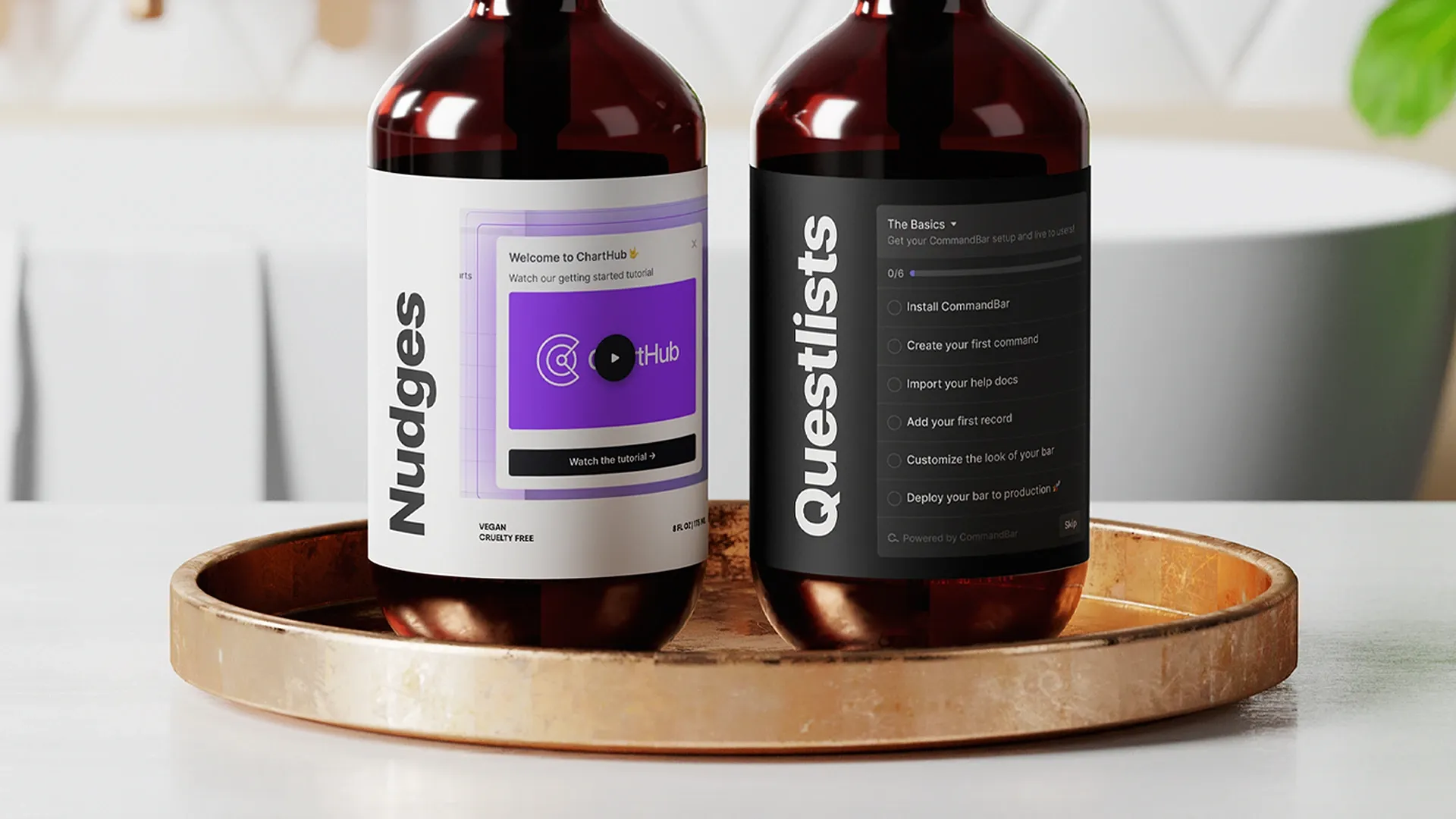
The reason we built Command AI was to encourage end users to solve their own problems via an omnipotent wonderbar. This is fundamentally a pull strategy—users are encouraged to use the search bar to both carry-out actions and discover actions—and that pushes users to explore a product by clicking on suggested search results. Search-based onboarding could even be paired with push strategies like product tours—for instance, you can fire off a nudge or questlist from a Command AI, strictly on the user’s choice.
Use tooltips on non-obvious features
Tooltips are one of the oldest product onboarding building blocks. A tooltip is an in-app message or description shown to a user when they interact with a UI element on a website or in your app. The great thing about tooltips is that they are typically shown on hover or click (e.g. those Learn More buttons).
The best thing about tooltips is that they can be hidden after a user has demonstrated mastery over a certain feature. Sometimes, though, a tooltip may never need to be hidden because its dormant state is near-invisible already—think about those tooltips that show up after hovering over those ⓘ icons.
Use context-driven nudges
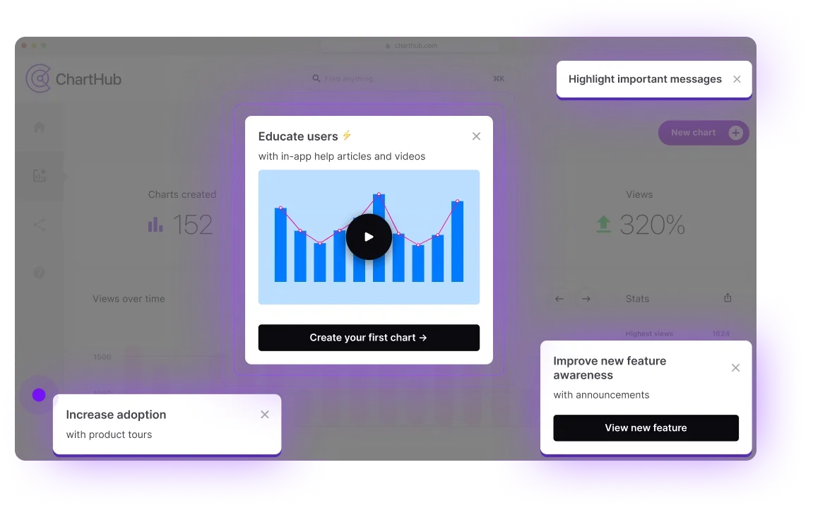
Nudges are notifications that deliver feature insights when relevant to a user. For instance, if a user enters a Trello-board-like page for the first time, and there is a hidden feature to convert the layout to a Kanban board, a nudge that alerts the user of that feature may be ideal. Notably, this nudge isn’t fired arbitrarily, only when its content is relevant to the user.
Unlike product tours, nudges are more likely to be read instead of instantly dismissed, provided they are dispatched at a tapered pace. Why? Unlike product tours, nudges don’t obfuscate most of the screen, frustrating the user less. As long as a nudge doesn’t cover a major button such as a Go-to-home icon, it isn’t dramatically impacting the user’s experience. So, a user is more likely to read a nudge and then utilize or dismiss it quickly.
While Command AI is mostly a pull-based service, you can dispatch nudges, technically a push strategy, using Command AI. The reason we invested in building nudge functionality is that nudges are barely invasive and operate similarly to pull-based strategies; they are more an optional invitation to check something out, not a workflow-halting alert. That makes for a better customer onboarding experience.
Track user onboarding flows
By tracking how users onboarding onto your product, you will be better able to deploy the right onboarding strategies. Today, multiple solutions exist to track an action-by-action user session without slowing down your application. Some of these solutions include Posthog and Amplitude.
Specifically, you want to track which features lead to low and high future usage. If you detect a certain pane or page typically precludes a user dropping off, you should watch sessions of users interacting with it to determine what about it requires a tooltip, product tour, or nudge. Additionally, if your app has a freemium or upgrade structure, analyze if any features were clearly “understood” that led to a user committing more money.
A user session-tracking tool is one of a few different types of tools that can help improve your SaaS onboarding process. Check out our article discussing onboarding tools.
Conclusion
A successful user onboarding process can pay dividends for your company. You can increase retention rates, ease the burden of trivial questions on your customer success team, and improve average user satisfaction with your product. By utilizing the right dosage of push and pull strategies, users should be able to cruise through your application without feeling like they are solving a puzzle.
As the SaaS ecosystem continues to expand and evolve, user onboarding will only become more important in crafting a competitive SaaS offering. Avoid customers from churning from your product and joining a competitor by building the right user onboarding strategy today. Be it through implementing Command AI or custom-coding user-tour functionality, ensure your users see your value after signing up for your product. Check out these examples of user onboarding to get some inspiration.
