Tens of millions of users, a brand so strong it became a generic term and a $975 million exit to Atlassian… that’s Loom. You know the product: Record your screen, talk over it, send it to your colleague. Congrats, you just replaced a meeting.
Loom is one of the prime examples of product-led growth: It’s inherently viral, doesn’t require heavy setup and has short time to value.
Before we get started: More of a visual learner? Want to make this easier to consume? I've also put together the full annotated onboarding with a voice-over:
Because they’ve mastered PLG, I analyzed the multiply-by-zero moment of product-led growth—onboarding. If your users don’t complete onboarding, they’ll never see anything else you’ve built.
So let’s learn from some of the best at PLG and dissect their high-converting onboarding. First screen:
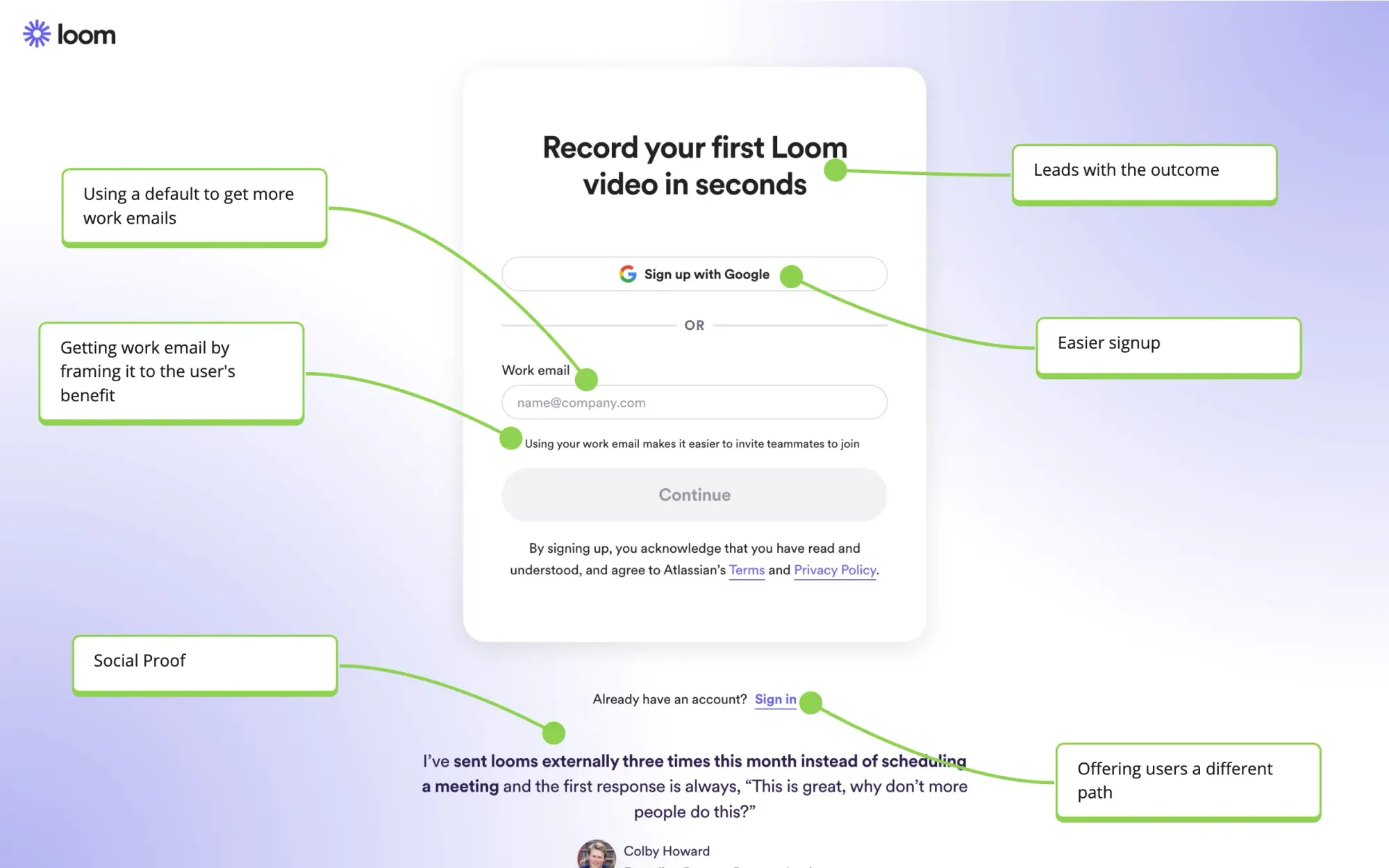
The first screen is simple yet effective. The copy leads with the outcome, "Record your first Loom video in seconds." This aligns with the user's intent and purpose. It’s easy to be lazy and use “get started” or something similar as the headline.
I also like the testimonial. It’s easy to take users for granted once they’re on the signup screen. But if you’re dealing with millions of users, even 0.1% of dropoff at a given step makes a big difference. That’s why a well-placed testimonial (which yet again focuses on outcomes users want) can convince more users here.
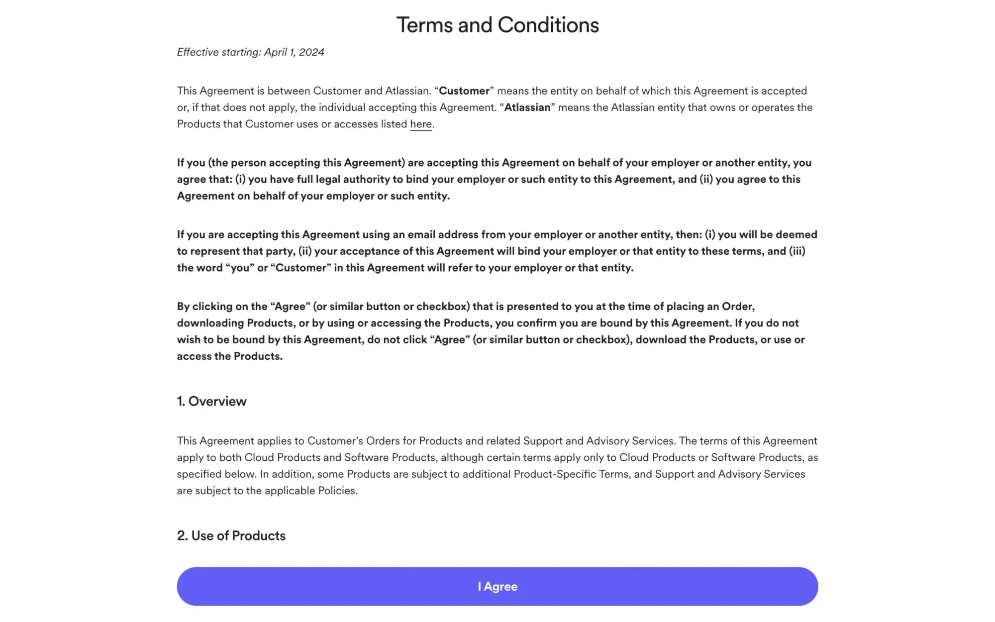
Next, we encounter a legal screen, which we'll skip over. I guess the only lesson here is that you need to work around constraints. No growth or product team mandated this screen to be here—legal did.
The next screen is more interesting:
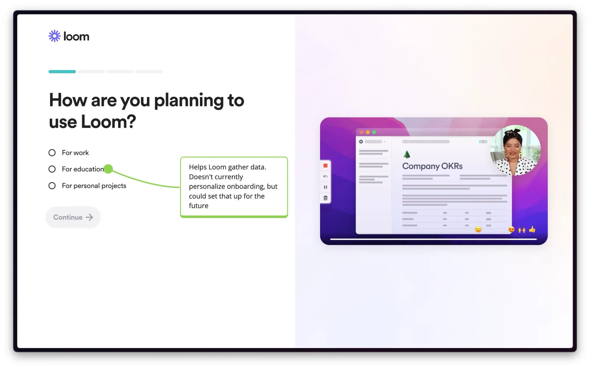
The following screen asks about your intended use for Loom. This helps Loom gather data, but it doesn't personalize the onboarding process (I’ve tried all of the options). What I do like is that Loom shares how people like you use Loom, directly sharing a good use case you might have for Loom.
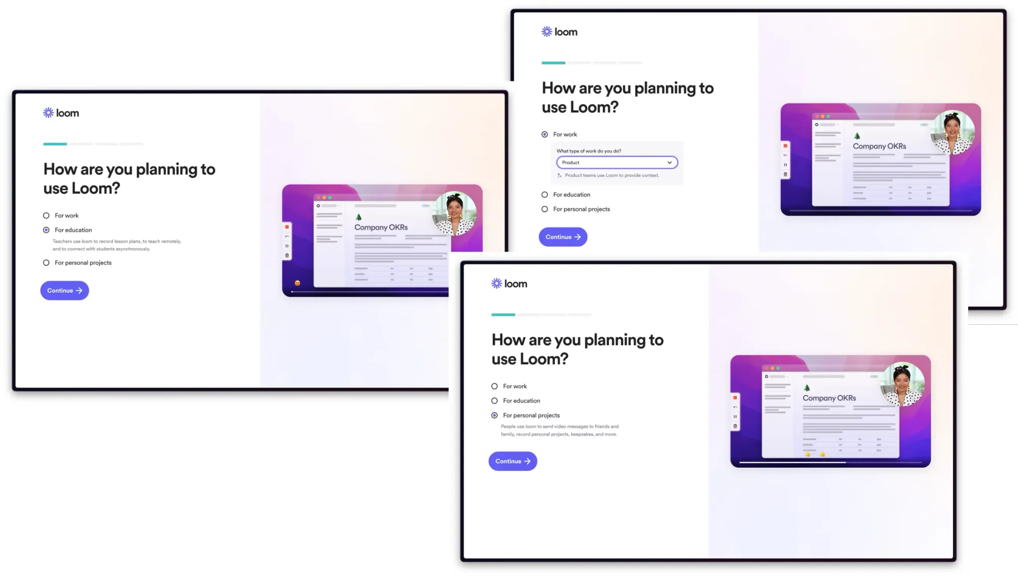
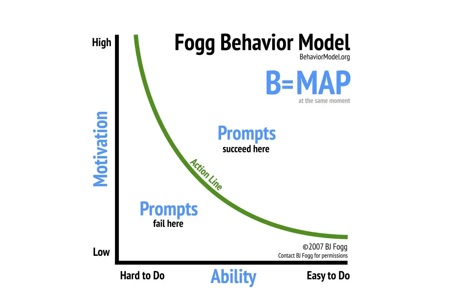
This again shows Loom’s obsession with user intent and helping users do exactly what they came there to accomplish. Reminding users what they’ll get out of completing something is how you increase their motivation to complete your onboarding:
As I mentioned—choosing “education” or “personal projects” changes nothing about the rest of the onboarding, though it does help the sales team prioritize outreach and helps Loom gather important data.
This uniformity might sound like a missed opportunity, but Loom already captures the highest-value use market: Businesses. It’s hard to make the case that Loom should build specialized onboarding for people pursuing personal projects when they could spend their time getting more business customers.
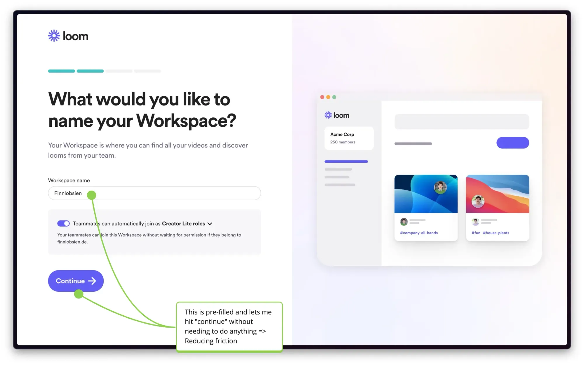
The next step is to name your workspace. The field is pre-filled, which reduces friction. Instead of needing to enter a name, you can just click “continue”. Also note the default setting of allowing teammates to join automatically.
This is another good user psychology lesson: Reducing friction makes more users complete your (onboarding) flows. It might sound silly, given that you could literally add a single character as the workspace name, but it does matter.
Too many companies build their onboarding for users lounging on the couch on a Saturday morning who will take the time to read everything in detail. More companies should design for someone going home on the New York subway—distracted, tired and drenched from the rain. If you can design onboarding so low-friction even that user will complete, you’ll increase your onboarding conversion.
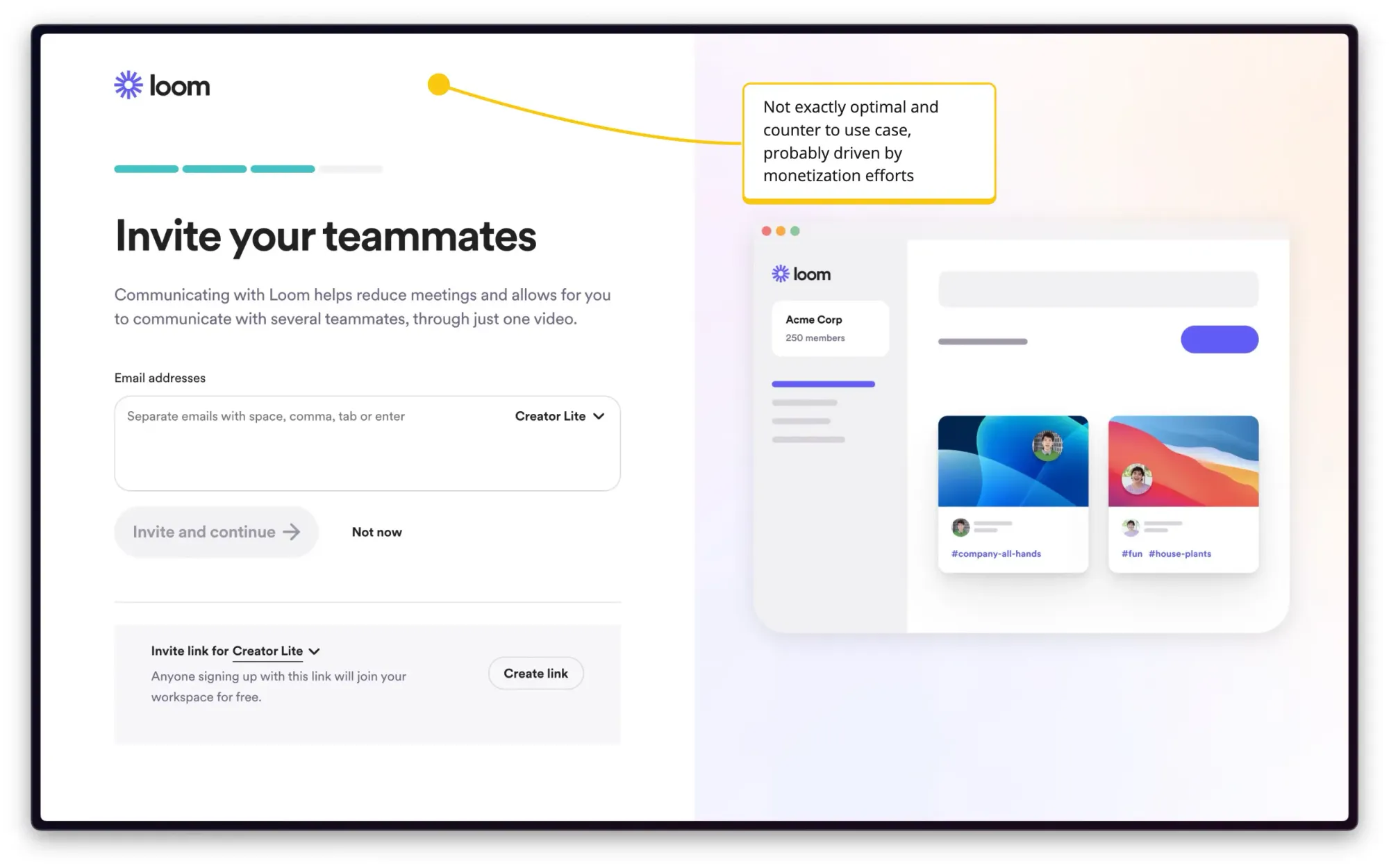
You're then prompted to invite teammates. The screen itself isn’t bad, but it feels premature since you haven't yet experienced the core value of the product. Why would I invite someone to use a product that even I haven’t used yet? Why would I risk my social capital and embarrass myself if my colleagues hate it?
I get it: The more people are on a team, the higher the paid Plan Loom can eventually sell me. I can imagine the meeting between the monetization team and the product team that squeezed this screen into the onboarding: Sure, it’s slightly worse for users, but we’ll make more money.
These considerations often appear as a company grows (and/or readies for an exit and needs to grow revenue). Efforts like this often work in the short-term, but can ultimately diminish user trust or lead to lower onboarding completion, which lowers the total amount of customers.
Now, Loom has to design around a unique constraint: You need an external piece of software to use it.
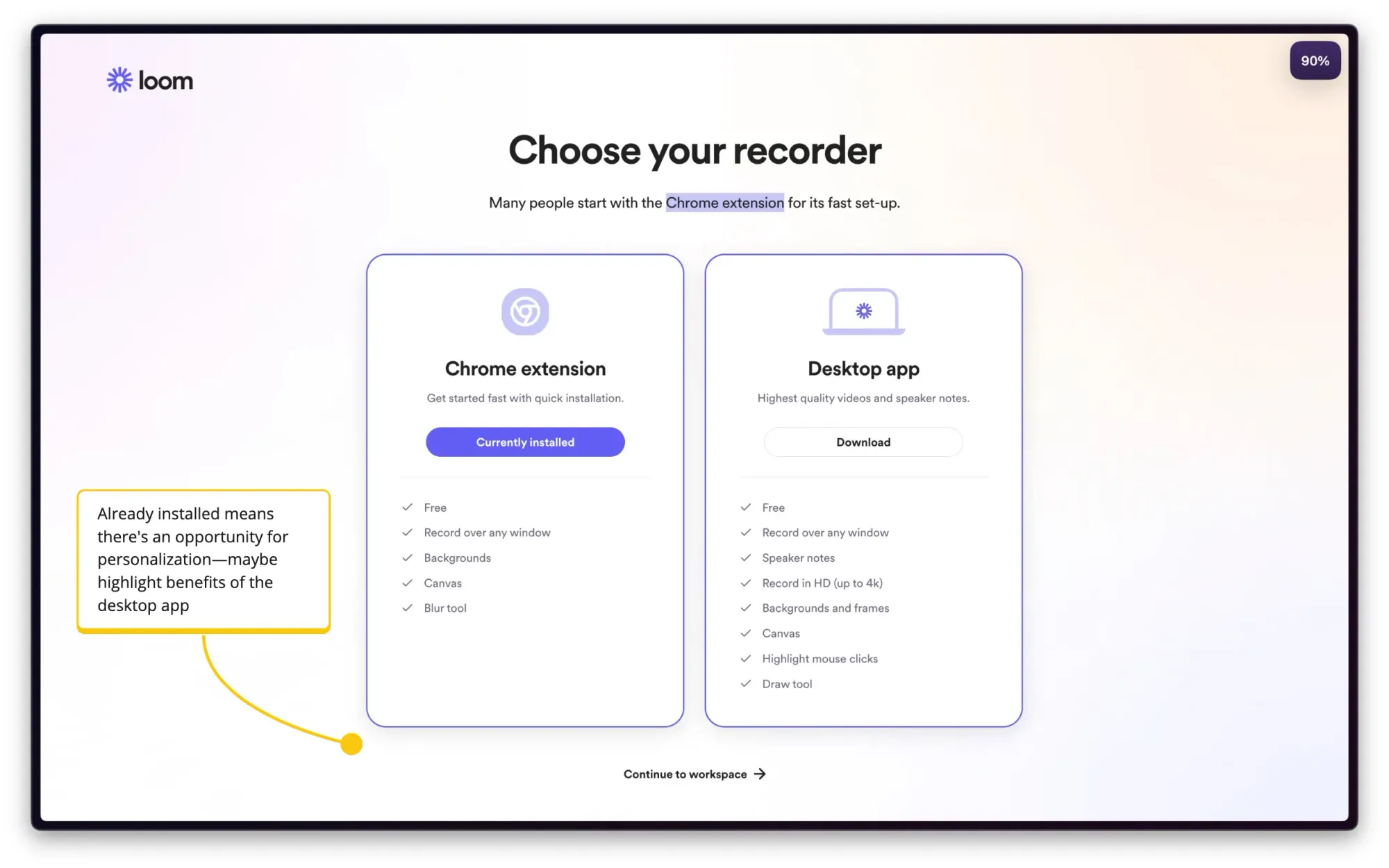
Next, you need to choose how you want to record your videos. The options are a Chrome extension or a desktop app. It accurately detects that I already have the Chrome extension. This is a good reminder, but it would also allow for better personalization like extolling the virtues of the desktop app if the user already has the extension installed.
I also like the subtle “continue to workspace” button that lets users skip this step.
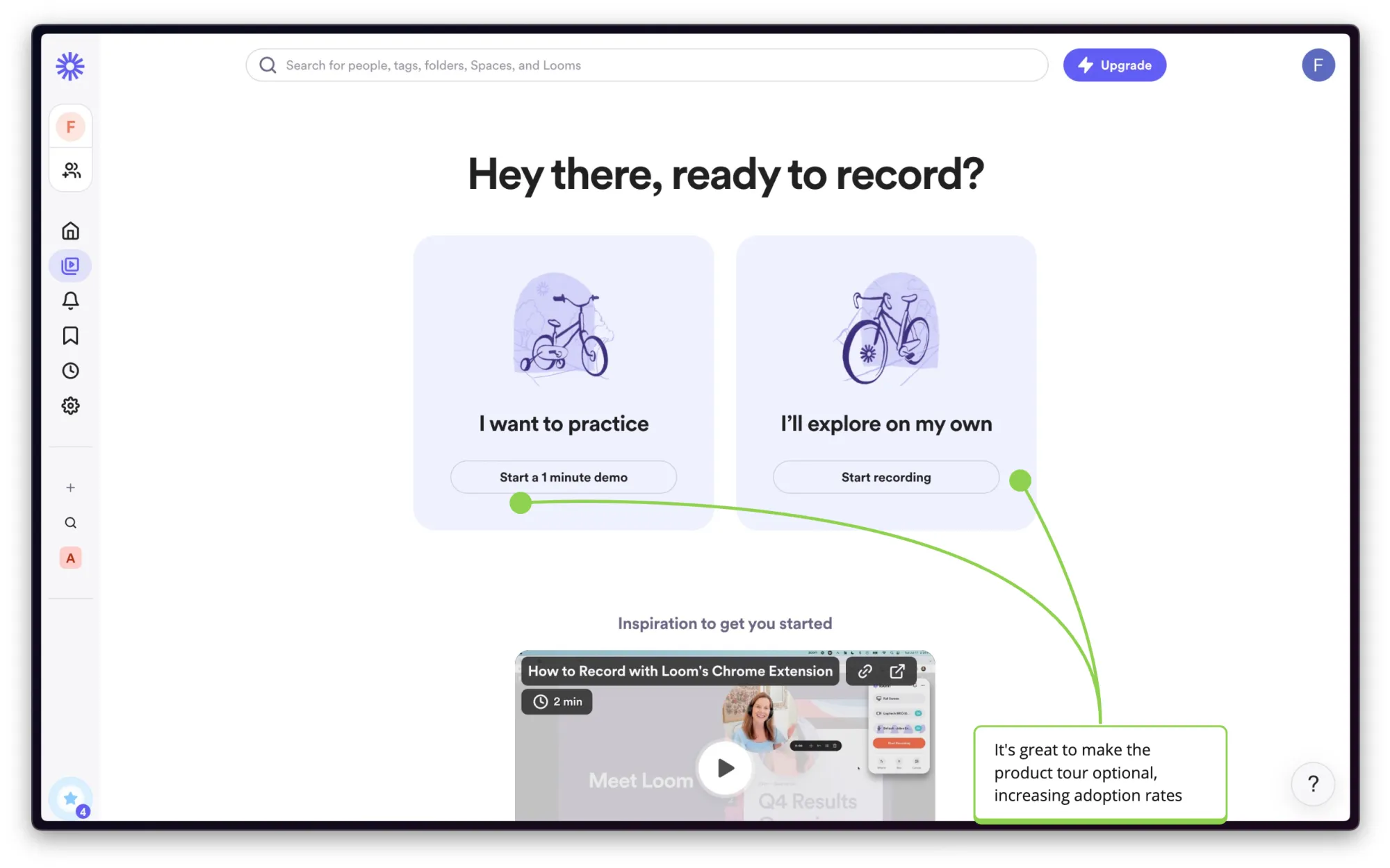
When you get to the dashboard for the first time, you get a custom screen where you're offered a product tour. This is a great way of letting users choose themselves whether they want to take a tour or not.
Too many companies simply barrage all users with a long product tour and don’t ask the user if they actually want that. There are good reasons users don’t need a tour: A user might have switched jobs and already knows the tool. A user only needs one quick feature (for now), not the entire product.
This is why forced product tours are annoying. Plus, we’ve seen in our data that experiences like product tours get 10x higher completion rates if they’re initiated by the user, not the company.
Next, an onboarding checklist pops up:
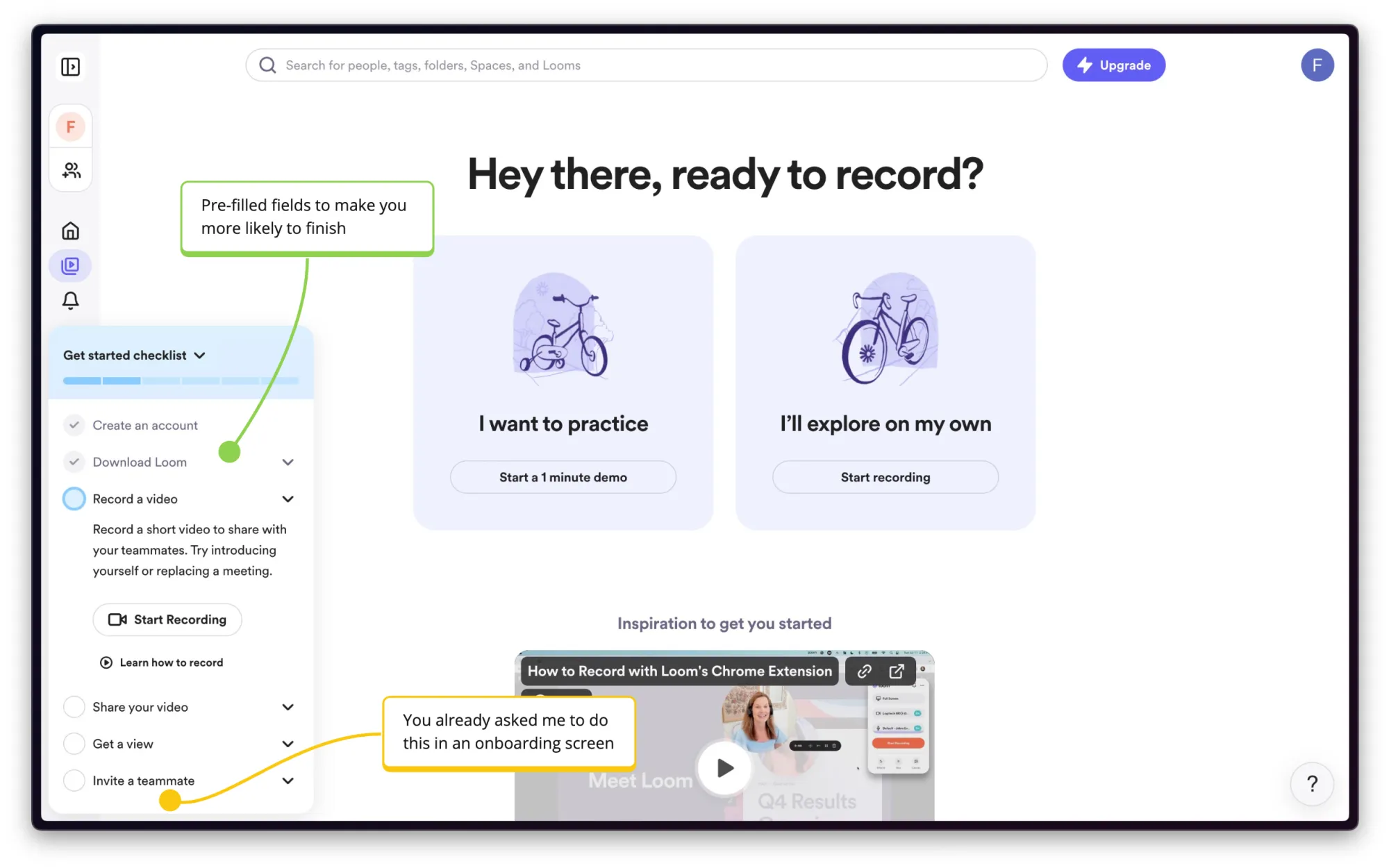
The first part of the checklist is already filled out, which is a clever psychological hack that encourages users to complete the process. Humans are more likely to finish something they started than to start something completely new. By framing the already completed steps as part of that checklist, Loom increases their completion rate.
One thing I don’t like is that they ask me to invite a teammate again—if I wasn’t ready 20 seconds ago, why would I be now?
Finally, I want to show you something cool that happens after onboarding—once you’ve recorded your first video.
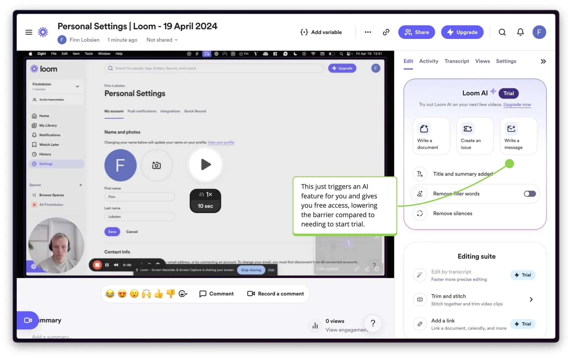
Loom showcases its AI features by automatically creating a title and summary for your videos. It's a smart way to provide value upfront without forcing users to commit to a trial or upgrade. This means you directly see the value of the AI features instead of needing to be sold on them.
Conclusion: Why Loom’s onboarding converts
I hope you’ve learned a few cool onboarding tactics from Loom in this article. From the obsession with the user’s use case to the subtle psychological hints, Loom delivers a smooth onboarding experience that gets users started without being annoying.
Want to make it way easier to ship best-in-class onboarding like this? Book a demo with Command AI today.
