When product teams are building the perfect SaaS product, they inevitably have to leave some features off the roadmap. They have to prioritize the highest-impact features, meaning that some helpful but not critical features never get built out in the product.
But thanks to add-ons, which are third-party tools or extensions that are layered on top of a product, are a great option to add the extra bells and whistles that didn’t quite make the cut during internal builds. These plugins can range from simple plugins all the way to complex integrations that enhance the core features of a product.
There are tons of benefits to add-ons, including:
- Saved time and resources since you don’t need to develop them in-house.
- Enhanced and more robust functionality
- Improved user experience
Some add-ons may include user assistance tools, plugins for Word documents, time tracking software, or creative asset libraries.
But beware: you don’t want it to feel like a frankenstein experience
It can be tempting to load your product up with all the add-ons that you can to make sure you’re delivering on any and all user needs. But throwing too many add-ons on top of your product (and not implementing them in the right way) can lead to a couple of critical problems with the brand customer experience.
- Inconsistent interfaces: If you implement add-ons with different UI designs than the product, you can disrupt the visual harmony of the product and lead to a fragmented user experience.
- Disjointed user experience: Conflicts between the product and add-ons can lead to confusion around navigation, functionality, and support, making it harder for users to use the add-ons effectively.
- Brand dilution: A mismatch in the design of your product and add-ons can weaken your brand identity, making it less recognizable and trustworthy.
None of these issues should discourage you from leveraging add-ons in your product, though. You just want to be selective about the add-ons that you implement in your product and be really intentional about how they will fit into the user experience.
Strategies for keeping a consistent brand customer experience with add-ons
Choosing the right vendors
When you’re looking into vendors to provide the add-ons you need for your product, you want to make sure to find one whose values and functionality aligns with your brand. Evaluate their design standards, user experience, and customer support to identify any potential conflicts.
Jira is a great example of integrating with tools that align with their brand well, such as Slack and Confluence. There is harmony between the brands visually and values-wise, so it’s not jarring to the users.
You want to conduct thorough research and get hands-on demos to test out how well the vendor’s product integrates with your own.
You also want to ensure that the vendors have incredible customer support. Since the experience that users have with their add-in has a direct impact on their overall experience with your product, you want to make sure that their team is fast-acting helpful in resolving any problems as they arise.
Customization and flexibility
You want add-ons to naturally fit into the overall brand customer experience, not stick out as a functionality that was clearly added on by a different vendor. Visually, you want it to be as consistent as possible.
That’s why it’s important for any add-ons that you implement to give you customization settings to help match your brand’s color scheme, fonts, and overall design language.
Customization should go deeper than just the visual appearance of the product, though. The best add-ons should help you integrate your brand personality, too, especially for chat products.
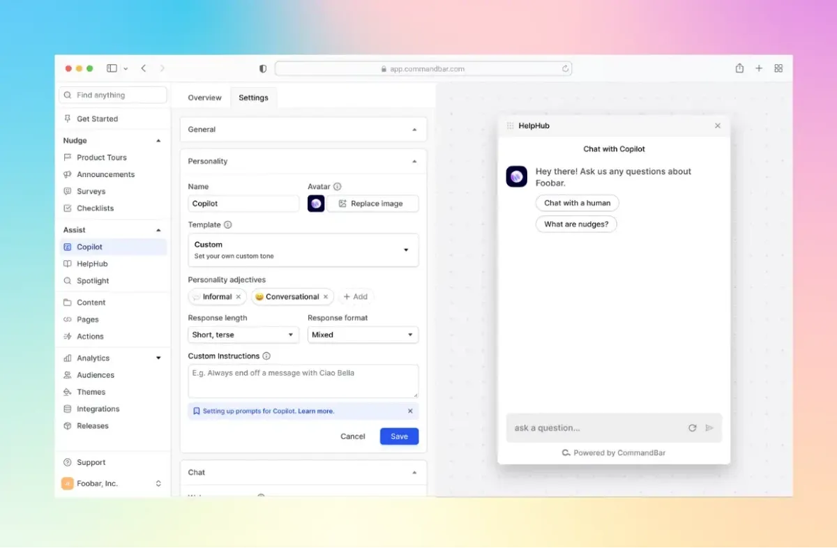
For example, we built Copilot, an AI-powered support agent, with a personality feature to make it feel like more of an extension of your support team. You can input data like the name of the AI agent, an avatar, adjectives to describe its personality, tone, and more.
This actually offers you an opportunity to not just stay consistent with your brand customer experience, but actually scale it. You’re able to extend the personalities of your human agents through this AI agent.

Seamless integration
So far we’ve been talking a lot about aesthetics, but you need to make sure that the nuts and bolts of your add-in lock in tightly with those of your product. Of course, you need to verify that the connection between your product is stable and secure so that you don’t sacrifice the security of your customers or introduce any bugs into your product.
A seamless integration also involves similar UI components and interaction patterns. If core ways that users interact with your product are different from how they need to interact with the add-ons, it’s going to lead to confusion or frustration. Things like navigation, selecting, zooming, or other tactical components should be consistent across all experiences.
Google Workspace really nails this with the plug-ins that they incorporate into products like Google Docs. There are a variety of integrations that users can take advantage of in Google Docs, like Semrush SEO writing assistant, Grammarly, and Docusign. As you can see in the screenshot below, it fits seamlessly into the brand experience that Docs users are used to.

Consistent user experience
Even if you selected the perfect vendor for your add-ons that align with your brand, have great support behind them, and can easily integrate with your product, the most important step is coming where and when to drop these add-ons into the user experience.
You don’t want add-ons to feel like separate entities that distract from the user journey, instead, you want them to feel like natural steps in the user journey. For instance, if your product is a project management tool, integrating a time-tracking add-on should fit seamlessly into the tasks that users are already doing in your product.
Consider the most natural point in the user journey to introduce the add-ons. For example, if you’re integrating a customer support chatbot, place it where users typically encounter issues or need help, such as on a settings or help page. This ensures the add-on appears contextually relevant and useful.
The verdict: use add-ons, but use them strategically
Add-ons are not an opportunity to overload your product with features that few people need or that introduce a million other brand attributes. Just like you have to be selective about which features to build natively, you want to think critically about the add-ons that you allow into your product.
But when implemented right, add-ons are an incredible opportunity to enhance your user’s productivity in your platform and deliver more value within the context of your product, without placing any extra burden on your development team.


