Some products might try to convince you otherwise, but nobody intentionally builds a bad user experience.
Most product designers, managers, etc. are skilled professionals with good intentions. So why does it feel like many products are designed for alien life forms who enjoy clicking through 7 settings pages?
While everyone tries to build great UX, most companies fail at it. That's because they start to think like product people, not like users. They stop seeing what a user would want in a given flow—and start seeing how putting that element there would boost engagement.
In other words: They stop thinking about user intent. And that leads to low activation rates, high churn, low signups. These are all signs that your product experience isn’t meeting the needs of your users. Even if there’s not a specific problem, UX is a continuum that you can always iterate on and improve. Getting to the root cause of this mismatch between user needs and UX is often the real issue.
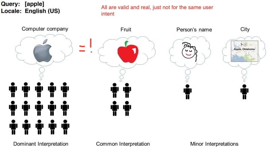
Thankfully, there’s a superpower that you can develop that can help: understanding user intent.
What is user intent?
User intent is what your user is trying to do in your product. It's what they have in mind. Let’s take a SaaS example. When you using a SaaS app, you have two basic types of intent:
- Search intent: “I’m looking for feature X or a feature like X”
- Browse intent: “I want to see what this can do”
In that SaaS context, search intent means the user has a specific job-to-be-done in mind. They are in exploit mode; in other words, they want to use your software to do something. For example, an existing CRM user might be trying to add a new lead, rename a pipeline stage, or generate a report. They might also have some conception of how that job is performed in the app and may be searching for the entry point.
Browse intent in a SaaS context means the user is learning what is possible with your app; they are in explore mode. We all do this as users, especially the first time we enter a new product. A common example of this is clicking on each page in the main menu bar of a product. You're checking out features and integrations with no specific goal in mind. But when you’re browsing, you’re probably doing so with more than a blank slate. You may have some hypotheses about what the product is good at, some features you are particularly interested in, or concerns you have about migrating to it. These aren’t intents in the traditional sense, so at Command AI, we call them inklings: they are ideas the user has about the product that don’t map to a job-to-be-done.
Why should I care about user intent?
There are two ways to satisfy an intent or inkling:
- In the moment: If your product can respond correctly, you can help the user achieve their goal (in the case of intent) or update their mental model of what you do (in the case of an inkling). This is especially important for new users and prospects looking to get started or exploring your product, especially if you have a product-led growth (PLG) motion. If you can understand their intent or inkling, you can improve activation and upgrade conversion rates, or enable folks to move down the feature adoption funnel.
- After the fact: Leveraging search logs is an often underutilized PLG power-up. By understanding unmet intent and inklings, you can help make product changes to better serve it. It can also help you classify your users. For example, you might have a bunch of users who had intent to set up a particular integration. When you add that integration, you can reach out to that group, in particular, to encourage them to check it out. Or it may lead you to uncover a common source of confusion, so you can help to reduce user friction.
Non-obvious ways of figuring out user intent
Let them search
This is by far the most effective tip. I’m putting it first to save you time 🙂. Most of the time in software, we have to convert our intent and inklings into clicks. If we’re interested in a particular integration, we have to go find the page in the app that corresponds to Integrations. If we’re curious about how hard the software is to migrate to, we have to understand what migration means in the context of the app and what I currently use.
Allowing search turns on the narration track to user behavior. The key is to include a federated searchbar, whose results can include actions, data, and help content. That way, a user is encouraged to dump their thoughts, whatever they may be, and let the app respond with what it thinks is most relevant.
This is very different than most searchbars. If you enter a new app and don’t have any data in your workspace, why would you use the searchbar? That’s the difference between a regular searchbar and a federated searchbar: the latter is searching through the entire concept space of the app.
Ask them, “what are you trying to do?”
If a user has very vague inklings, they may not search even if you put a big searchbar in front of them. In these cases, it can be helpful to give them a nudge toward telling you what’s on their mind. You can do this with a nudge (Command AI example below).
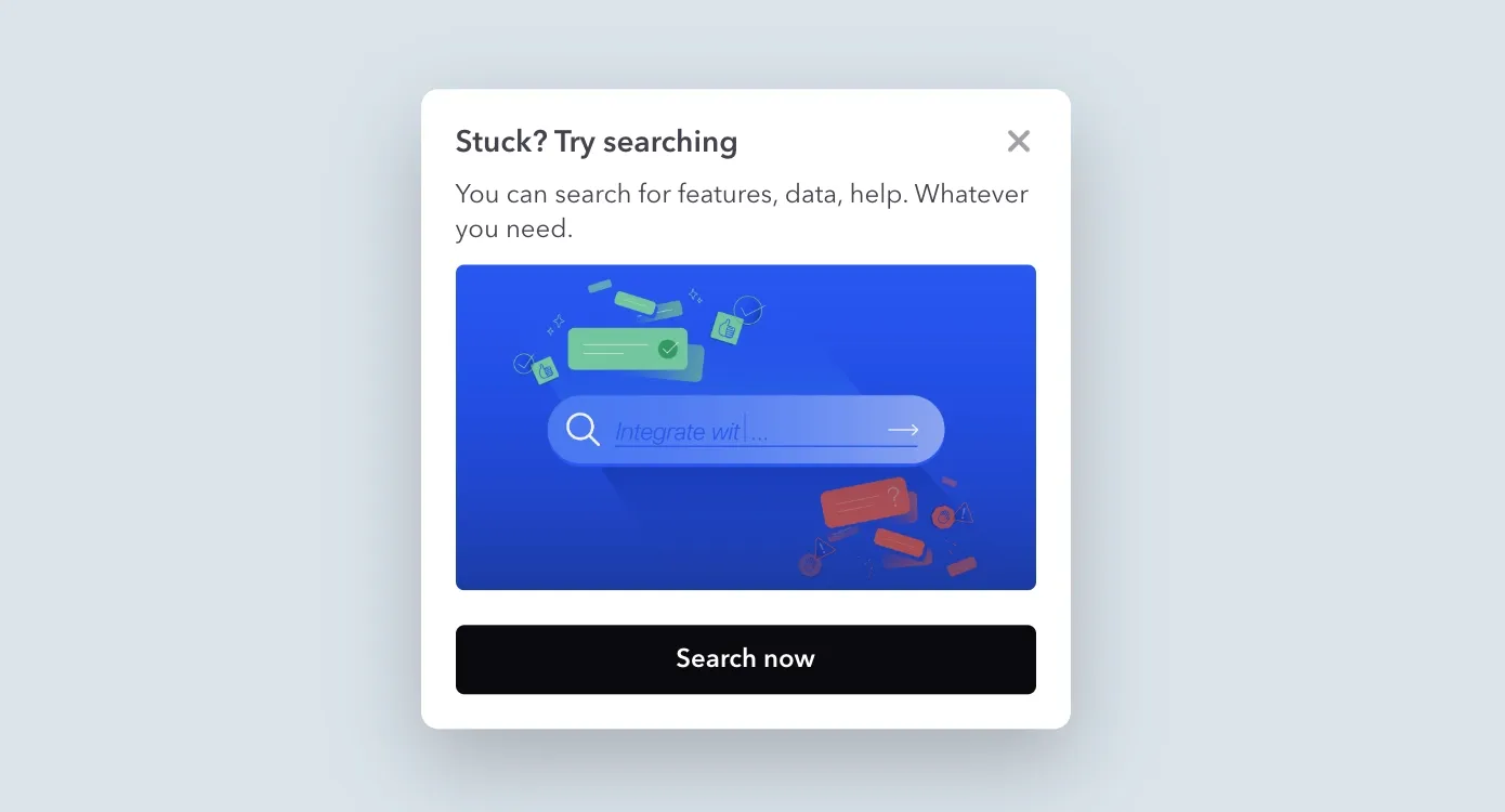
Since most pop-ups are annoying, the key is to only do this if the user (a) doesn’t seem to be making progress on their own and (b) isn’t using your searchbar. In the nudge, you should reassure the user that they can type anything into the box and that what they put in the box will be used to guide them in the right direction.
Alternatively, if you have a searchbar, you can encourage the user to search in it with a nudge that points to the search interface and explains what it can do. “Looks like you’re browsing around, put whatever is on your mind in this bar, and we’ll take care of the rest.” This may give you Clippy vibes for sure, but we think a lot can be learned from Clippy’s missteps.
Another great way to identify hidden user intent is through a user assistant tool like our Copilot. While its primary user-facing function is to answer questions and deflect support tickets, you also get all of this intent data that shows, in natural language / user's own terms and verbiage, what they're looking for and how they're interacting with your product.
Not only can you see this at a macro level, but you can also click into individual responses or into groups of responses, like dead-ends, where users were not able to get a resolution to their situation.
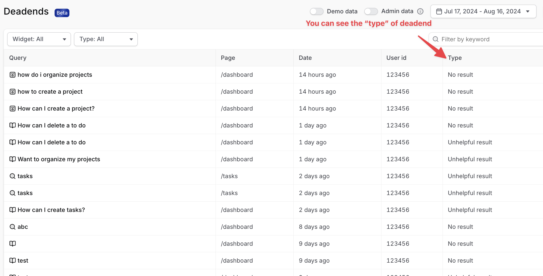
This means that there's an issue with your product or your help documentation, and you have a clear path to improvement.
Keeping an eye on this and clearly evaluating, analyzing it, and incorporating it into your product decision-making is a key part of turning user intent data into actionable product development insights.
Prompt them
After all, negative intent helps you understand positive intent. So if the above fails, you can give users a nudge in a specific direction. You can do this in a couple of ways:
- Point them to one of your most popular features (a tooltip works well)
- Give them a quest with a checklist
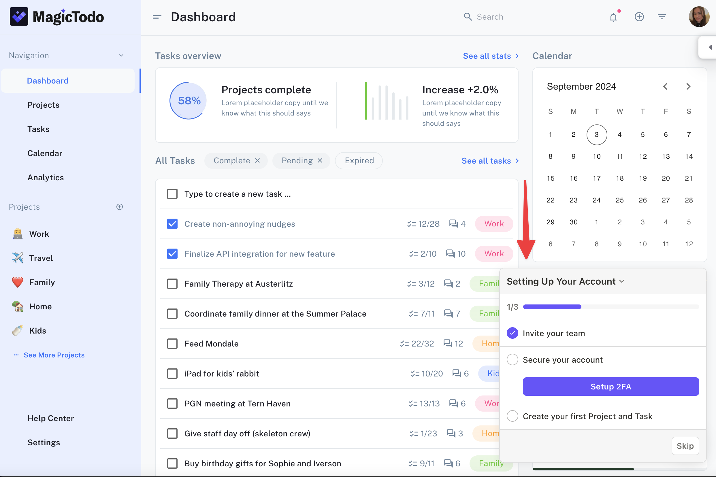
You’ll get one of two responses to this: the user will engage positively or negatively. If positive, great! Maybe you didn’t hit on their intent exactly, but you at least created engagement. If negative, well, at least you know what they aren’t interested in.
Watch user sessions
Watching users translate their intent or inklings into mouse movements and clicks is a great way to feel bad about your product 😅. But that’s a good thing! There is no substitute for a user bungling their way through a flow you thought was idiot-proof.
You’ll need a good tool to make this happen. A session replay tool is a must-have in your user friction toolkit. Check out Fullstory, PostHog, or Highlight.
That said, even equipped with a good tool, it can be a dark art to divine user intent from a session recording. For example, if you see a user clicking around all of your pages, you know they are looking for something, but you don’t know what. You know they are in explore mode, but you can’t do much to narrow down their inklings. That’s why we suggest doing whatever you can to get them to write, in their own words, what is in their heads.
Send them emails
Once a user leaves your product, they are way less likely to engage with you. But you can still try! This is an after-the-fact version of the in-product ‘Ask Them’ suggestion above. For any user that doesn’t make much progress in your onboarding journey (you’ll need to define that precisely to perform this exercise), send them a short email that says something like:
Hey -- Saw you didn't make much progress in . Why'd you try it out?
Hit reply and let me know and I can point you in the right direction.
But it’s important to be realistic here. Most emails don’t get read. What’s more, email is culturally laden with expectations. Since this email is coming from a human, the recipient is going to feel like they need to compose a civil response. They can’t just type “zendesk integration” and hit send. Response rates will be low - that cultural friction adds to the fact that the user has probably forgotten their intent and/or inklings anyway.
Look where they came from
This is an outside-in exercise, but it’s helpful when you are performing some of the strategies above. If you have a healthy top-of-funnel, your users are probably coming from multiple places:
- Referrals from other sites
- Paid ads across different channels
- Social media
Users coming from the same sources tend to arrive with similar initial conditions. For example, users who clicked on your ad emphasizing multiplayer functionality are probably interested in trying out that functionality. There are many other sources of buyer-intent data that you can leverage (like review sites such as G2 or TrustRadius, or keyword intent services like Bombora), but at best, these will likely only be able to point you in the direction of their job-to-be-done, rather than more granular insights that you’d get from a search within your product.
Whatever way you go about it, though, figuring out user intent is a huge unlock. With it, you can get to the bottom of low activation rates. Or, it can help you to diagnose high churn and understand stalling signups. Deciding what to do with it is the next problem. But it’s a great start. Good luck! 🤞
