The "aha" moment is a bit like product-market fit: Everyone wants it, but nobody can define it.
It's the moment your user "gets it"—the moment after which they're likely to stick around, engage and pay for your product—because they see how your product helps them reach their goals. Identifying this moment can unlock higher user growth: It tells you what to steer your UX effort towards.
This is vague, so let me give you an example: For Shopify, making a sale is clearly an a-ha moment. Once you're making money, you get why you use Shopify—and you want to repeat that experience, so they keep driving traffic to their Shopify store, which correlates to how to get more sales on your Shopify store.
While this is obvious for Shopify (especially for first-time entrepreneurs), it can be harder for other products. While many products have milestones, it's hard to identify which one is an a-ha moment—and which is just a checklist item. This difference matters: Importing your email list to an email marketing provider is a technical necessity, but not an awesome moment in the user journey.
In this article, we'll explore what aha moments are, how to identify yours and how to get more users to aha moments so that you can convert more signups into paying customers.
Key Takeaways
- Importance of time to value (TtV): Rapidly demonstrating product value is critical. Studies, like one from KickOffLabs, show significant improvements in lifetime value when users grasp the product’s utility within the first few minutes.
- The power of user onboarding: Effective onboarding is crucial for user retention, with research indicating a high percentage of users feel companies could improve in this area.
- Understanding aha moments: An 'aha!' moment occurs when a user realizes the core value of your product. It's the point when the utility of the product becomes clear, often deciding whether they will continue using it.
- What an aha moment is not: It's crucial to distinguish 'aha!' moments from basic user achievements like understanding a feature or completing onboarding flows. These are important but don't necessarily translate to realizing the product's core value.
- Identifying aha moments: Segmenting users and analyzing behaviors can help identify these moments. Tools like Fullstory and Highlight can assist in understanding user interactions and pinpointing where users truly grasp the product’s value.
- Guiding users to aha moments: It's essential to guide users towards these moments without being overly pushy. Creating 'happy paths' and using onboarding tools strategically can help users discover the value of your product organically.
- Responding to user behaviors: Tailor your approach based on user actions. For instance, if a user dismisses several onboarding modals, it might be wise to give them space before introducing more.
- Leveraging multiple moments: If one 'aha!' moment doesn’t resonate, guide users towards others. Utilizing various onboarding strategies like checklists can help in this regard.
Understanding Aha Moments
To appreciate this challenge, consider the headspace of a new user:
- New users, just like the rest of us, have short attention spans and a lot on their plates.
- New users are entering your product with very little to no understanding of what your product is and how it works.
- New users also have a host of other options (namely, your competitors) to consider.
There are a few obvious implications for any product:
- It's critical to help users find value in your product ASAP. There's a reason why "TtV" (time to value) has become such a buzzword in the SaaS world – KickOffLabs discovered that "Improvements in a user's first 5 minutes can drive a 50% increase in lifetime value."
- User onboarding is a great tool for improving user retention. Wyzowl found that "Over 90% of customers feel that the companies they buy from ‘could do better’ when it comes to onboarding new users/customers."
And the implications are only more acute the further along the product adoption curve your product is - innovators will forgive rough edges, but later-stage folks are less forgiving.
What is an "aha" moment?
An "aha" moment is when a user has a mini-epiphany and internalizes your product's core value proposition. For many users, this sudden awareness coincides with the moment they decide to invest in your product.
Sean Ellis captures this succinctly in his book Hacking Growth: "Aha is the moment that the utility of the product really clicks for the users; when the users really get the core value — what the product is for, why they need it, and what benefit they derive from using it."
But many of the common examples are from giant companies. Startups are different: We operate in niches and don’t have the big datasets (and data teams) that let us pinpoint a-ha moments from quantitative data. Without that, you need to look at more qualitative data points.
So let’s look at a few startups’ products might look at a-ha moments—based on a few personal experiences I’ve had:
Loom
Are you still a startup when you’ve been acquired for $975 million? In any case, any startup that became a generic term (”send over a Loom”) did a lot of stuff right.
So here’s my take: Loom never competed with other screen recording apps. It competed with typing and “hopping on a quick call”. Look at their home page messaging from a few years ago:
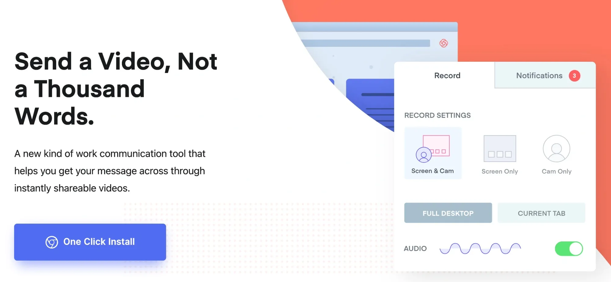
That’s why the a-ha moment for Loom is counterintuitive. You might think it’d be realizing that screen recording is easier than you thought. But that’s not the core use case of Loom.
The a-ha moment for me (and, I suspect, many others) is the first time I sent a video that resolved something without needing a meeting—and saved everyone time.
This is fascinating because it shows that not all a-ha moments need to be in-product experiences. Because Loom’s a-ha moment is realized outside the app itself (e.g. in a Slack thread that says “That’s great, I cancelled for tomorrow!”), that requires different product prioritization.
Based on using Loom, they clearly acted on that insight by focusing on good video embedding in Slack (and elsewhere).
Tome: ChatGPT for slides
AI apps are perhaps the most “magic” software we use today. They do things we never considered possible. Tome is one of those apps: It’s an AI-powered presentation app.
What ChatGPT does for writing, Tome does for slideshows: It creates a slideshow from a text prompt, format and everything included.
These aren’t perfect, but they’re good first drafts. While I could’ve drafted the copy with ChatGPT, it still would’ve been annoying to paste into another slideshow deck.
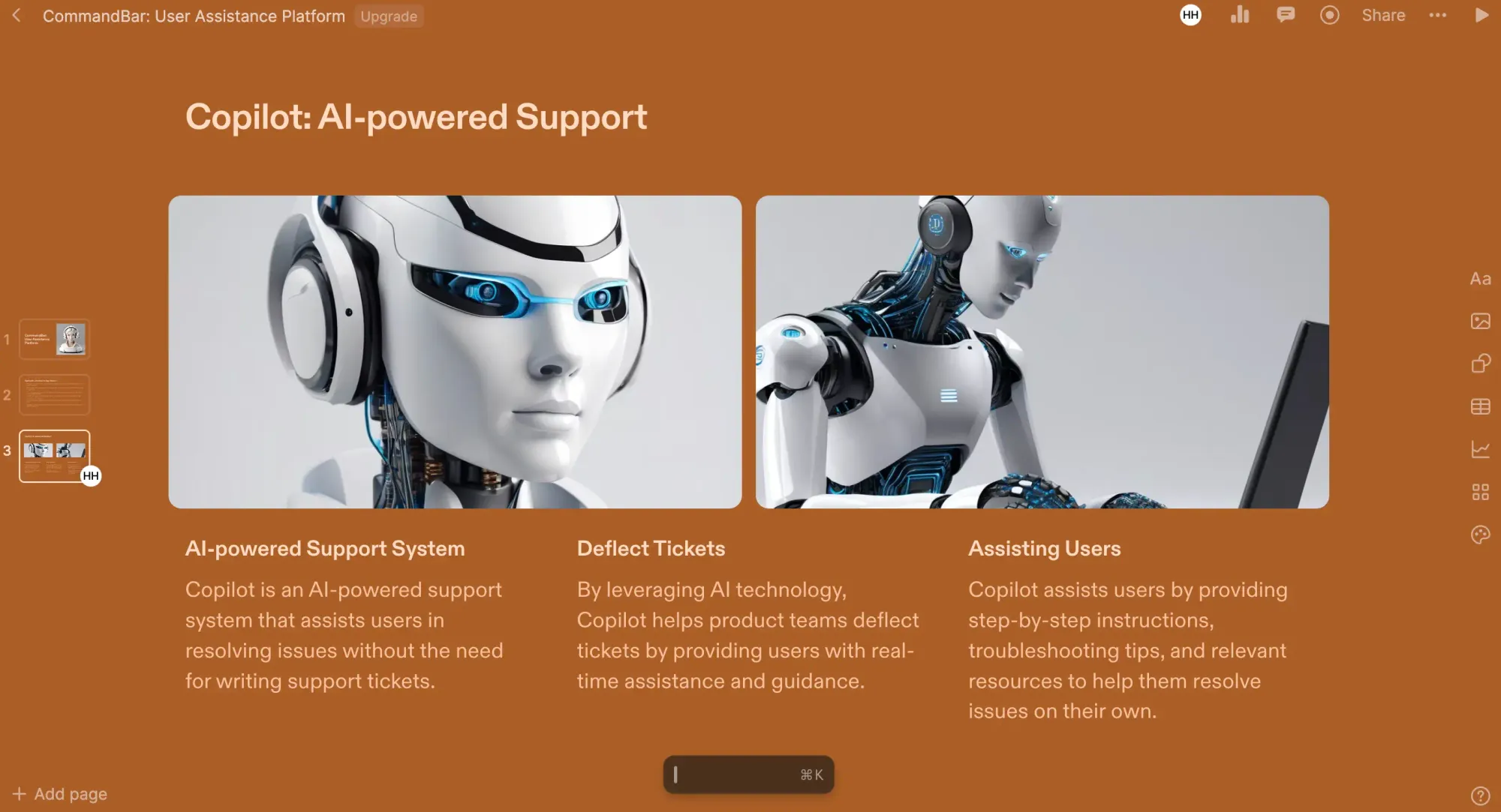
Would I ship those images? Would I use that exact copy to pitch a prospect? Probably not. But it made the journey to a passable slide deck so much shorter than I expected.
Veed: Canva for Video
Years ago, it felt impossible to do graphic design: You had to learn Photoshop/Illustrator (which was expensive) for years before creating something that didn’t look like a middle school project (graded C+). Then came Canva. Suddenly, I could make things that looked good enough without spending years learning. And do it for free.
Until a few months ago, I felt the same way about video. Whenever I even thought of creating a video, I was worried about the headaches that would come with it. It never seemed worth the hassle. But then Veed happened.
Their home page messaging spoke exactly to my pain point:

With Veed, I created a good-enough video in just 30 minutes, posted it on LinkedIn and got more signups to a workshop I was running.
This instantly made Veed my go-to when it comes to video!
But as we've just seen, aha moments can be tricky: There's a lot of things that we'd like to be aha moments, but aren't—maybe because they're not as interesting or because they don't happen in our product.
What an "aha" moment is not
“Aha” moments are referenced so often and so loosely that the meaning has become a bit murky. Most, and close to all, accomplishments along a user journey are not "aha" moments. It’s helpful to understand common examples that might seem like "aha" moments but are not. Think of these as cousins or siblings of the "aha" moment.
The user understands how to achieve something in the product
While fundamental, this is not an “aha” moment. For many products, making it not just possible but ensuring the UX is frictionless for your users to achieve what they want is a prerequisite for an “aha” moment. It's also important to focus on which product flows you are enabling. Generally speaking, you should create "happy paths" for use cases that are frequently associated with user success. The ultimate goal is to help your users realize why they should stick with your product.
Figma is a great example of this. The base requirement of a design app is that a designer needs to be able to design what they want. Of course, it helps to make that core design experience seamless, but Figma users' “aha” moments often come from experiencing the collaborative features of the product, like sharing a mockup with teammates and engaging in discussions around various aspects of their design.
The product’s value has been communicated to the user
Many products fall into this trap of telling and not showing — “We told the user why our app is valuable; what else is left to do?” It should go without saying, but there is a massive difference between telling a user that your app is valuable and showing them why and how your app is valuable. The former comes across as empty marketing; the latter is what it takes to earn a customer’s business. Many products benefit from tooltips, checklists, and other forms of in-app guidance to bridge the gap between telling and showing.
The user completes your onboarding flow(s)
Awesome! You’ve taken the time to design and implement an engaging user onboarding flow. Your users are completing the onboarding and are equipped to use the functionality you guided them to try.
If you’re seeing the retention you want, then well done, your product is almost certainly putting users on track to experience their “aha” moment.
Users completing your onboarding process does not necessarily mean that users are experiencing an "aha" moment, though.
If you are not seeing good retention, then you should consider whether the onboarding process is highlighting the right parts of the product in the right way. Users might understand the value of what you are showing them, but it might not be the value they are looking for.
User testing, user feedback, user research, especially with churned users, and session playback tools (like Fullstory and Highlight) are the tried and true methods for debugging scenarios like this. These methods can help a product team identify: a key missing feature, use cases that are given second-class support, high friction flows, and much more.
"Aha" moment, by another name
Hopefully, the previous section clarified the scope of what qualifies as an “aha” moment. If not, there are some interchangeable names that might ring a bell:
- activation moment
- eureka moment
- light-bulb moment
- wow moment
- time to wow
- time to first value
Some explanations will dive into the science of the "aha" moment and how it affects brain activity or is related to some set of neurotransmitters to explain it. Potentially insightful, these explanations tend to over-complicate and over-romanticize this moment. At its core, the "aha" moment describes when a user has absorbed some core element of your product and suddenly realizes why they should continue using your product. For example, after using your product for a few days, a user might have a sudden insight into how they can accomplish an important set of tasks with your product.
"Aha!" quiz: which one of the following is an "aha" moment for the app?
Let’s put everything we’ve learned about “aha” moments to the test with some real product examples! The goal here is to distinguish “aha” moments from other, less-spectacular in-app moments. We’ll cover examples from Twitter, Facebook, and Slack.
Consider the core pieces of the Twitter customer lifecycle. Which of these is most likely to be an "aha" moment?
- Create an account
- Follow first account
- Like first five tweets
- Publish first tweet
- Follow first 30 accounts
While creating an account and following an account are essential first steps. A Twitter user's "aha" moment is most likely to happen after liking their first four tweets or publishing their first tweet; however, Twitter's growth team found that the "aha" moment most often occurred after following 30 accounts. At this point, the user's tweet engagement and number of follows have helped create a Twitter feed full of content that the user enjoys. The user's conscious or subconscious realization that they like their feed is the core driver for user retention.
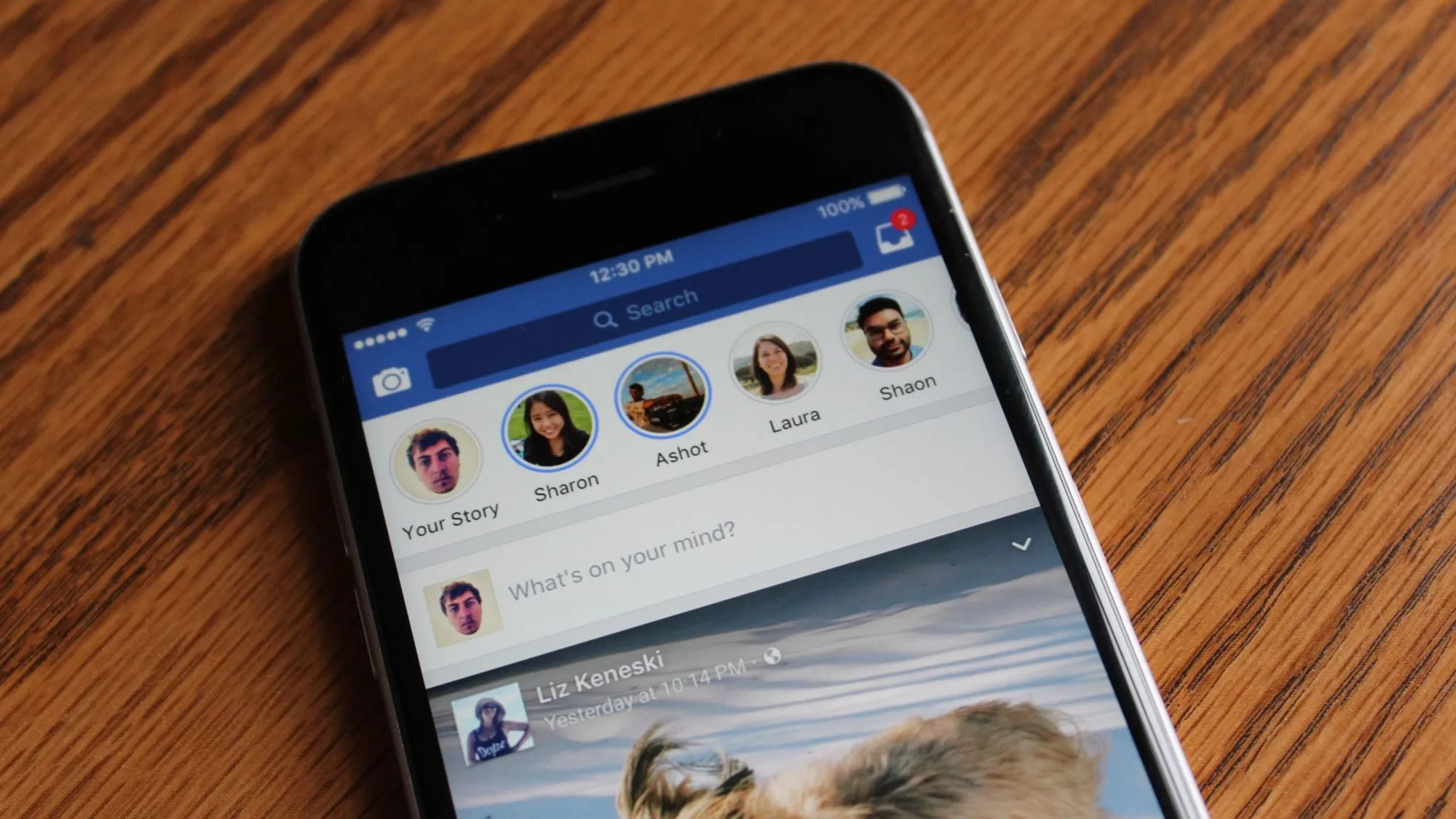
Onto Facebook, which of these core moments is most likely to be an "aha" moment?
- Create an account
- Add 7 friends, within first 10 days
- Share 5 updates, within first 10 days
- Upload 1 picture or video, within first 10 days
This is a famous "aha" moment example, so maybe you know the answer. Facebook's former Head of Growth, Chamath Palihapitiya, said that they used to obsess over the threshold of "7 friends in 10 days". This threshold provides a few interesting insights.
While not a guarantee for creating an "aha" moment for a Facebook user, adding 7 friends in the first 10 days was the action that optimized the relationship between "number of users that complete this action" and the "number of users that are retained". Adding 7 friends is pretty easily accomplished and proved to be enough for many new users to find content that they care about. On the other side of the equation, "in 10 days" was important because it captured the early usage period where a user's impression of Facebook is most malleable.
Helping a user find a solution or connect to your software in this early period is critical for retention. You might ask, "why 7 friends in 10 days instead of fewer or more friends in the same number of days?" We can look at examples on both sides of this number to understand what this means.
- "3 friends in 10 days": High number of users complete this action, but a small percentage of these users are retained.
- "50 friends in 10 days": An extremely high percentage of this group is retained, but very few users fall into this bucket.
Slack
This list of Slack user journey states covers a wide range of engagement, so it might be difficult to pick the one most correlated with "aha" moment. Good luck!
- 80% of a user's team is in the Slack workspace, in the first week
- 5 integrations are active in Slack, in the first month
- 2000 messages have been sent in the Slack workspace
- 20 channels have been created
A quick aside before diving in here: given Slack's ubiquity and market dominance today, it might seem strange to consider their "aha" moment. First, it wasn't always this way -- Slack was once a small, hungry startup. And second, ubiquitous products have generally (1) mastered the art of discovering their "aha" moments and (2) productized many UX/UI designs to optimize "aha" moments.
Tackling the incorrect answers one at a time:
- 80% of a user's team is in the Slack workspace, in the first week -- It's great to have most of a user's team in the workspace. But if the workspace is not being used actively, then Slack is likely not solving any pain around cross-team communication.
- 5 integrations are active in Slack, in the first month -- Integrations in Slack are often a cherry on top. Rarely do they make or break a team's trial. They generally add the most value after a team has committed to using Slack.
- 20 channels have been created -- A rich Slack workspace often has many channels; however, simply creating many channels does not mean that a team has derived value from Slack. If a channel goes unused, it is basically worthless. And if too many channels are created early on, then a team might become confused (not sure where to post) or overwhelmed.
Now for the correct answer: 2000 messages have been sent in the Slack workspace. Slack is most powerful when it is actively being used by a team, and 2000 messages have proven to be the make-or-break threshold. At this point, a team has likely adopted Slack into their everyday workflows and derives meaningful service from it. As the scale of messages grows, the ability to search through content, thread on previous comments, and develop automations make Slack an invaluable product.
X-raying your app to find "aha" moment(s)
Sadly, there is no magic pill that you can force upon your users to generate an "aha" moment. Fortunately, your app has at least one "aha" moment. There are some simple steps to follow that, with the proper attention and effort, will help you pinpoint your product's "aha" moments.
Segment your users
A useful mental framework is that of a school teacher. You have a diverse set of students with diverse needs. Rarely is a one-size-fits-all approach optimal. The most effective teachers are those that employ a variety of learning techniques to help students engage with their material and achieve lasting comprehension.
Your users are unique, and they are checking out your product to solve their problems. The same way students can be grouped together by their learning styles, your product's users can be linked together by certain attributes that relate to how and why they are using your product. The purpose of segmenting your users is to capture the similarities between them in meaningful ways.
For some companies, user segments are built around geography and age. For others, user segments revolve around the user's role (e.g., "Engineer" vs "Designer" vs "Product Manager").
Once you have a definition for your user segments, you can more precisely consider the user journey for each segment: What are the common challenges? What are the key feature(s) to solve those challenges? How can we guide users in this segment? Answers to these questions should help your team figure out where and how you can help these user segments quickly capture value from your product and unlock an "aha" moment.
Talk to your users, get user feedback
It's important to collect feedback and to mine insights from users across categories.
A power user is definitionally far along in the user lifecycle, but they might still remember their "aha" moment – what feature, workflow, or output made them aware of your product's value?
You should be running microsurveys to gather feedback regularly from users. User smart targeting to only ask them at the right time, like after a certain amount of time or after a specific event is completed, or after a specific user behavior.
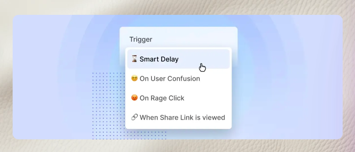
Feedback from a churned user is especially valuable because they can tell you exactly why they didn't use your product. Here you might need a more involved after-the-fact survey or conversation.
Maybe they found a better fit from a competitor in your product category, maybe they couldn't figure out how to do x/y/z.
Correlate with retention, but avoid selection bias
User onboarding tools like Command AI, Mixpanel and Amplitude allow you to easily analyze product adoption metrics, like retention. It's often useful to visualize retention data by specific feature adoption or where some condition is true. For example, thinking back to Facebook's "aha" moment, there might be some killer insights by comparing retention as a function of the number of friend requests sent in the first 10 days.
Once you get deeper into your product usage data, user studies, and user testing, significant insights will almost surely appear. One general rule to remember is that selection bias should be avoided at all costs; think of it as your "South Star". Say you have a user group of 100 opt-in users that your team is doing a deep dive on. Unless there was some universal incentive for these users to opt-in, the fact alone that these users opted in separates them from the majority of your users. What helps retain these users might not necessarily help retain the majority of your user base.
What to do with your "aha" moment(s) - how to build for them!
Now that you've taken the steps above to find your app's "aha" moments, what should you do?
Guide, but don’t be too pushy
Users, like most people, don't want to be forced to do something or told what to do. You can allow for an exception or two to this rule, but it should be a conscious decision to force friction upon your users.
Enable happy paths, don’t just show proactive modals and tooltips.
While important to help users experience their "aha" moment quickly, it is also not a race to aha. The user has to want to go on the path.
It is often tempting to go overboard with proactive onboarding modals, feature highlights, and in-app tooltips to get your users to execute your wishlist of actions. If users are overwhelmed by the suite of modals, they might ignore everything. Two points ring true here:
- Pare back your onboarding tools to the essentials.
- Productize "happy paths" that encourage and help users to find and take action.
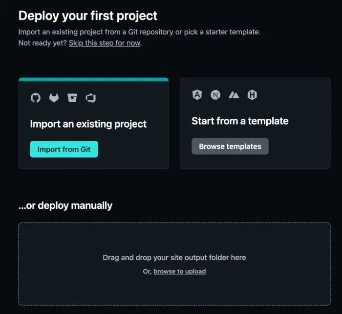
Netlify's signup flow offers a perfect example of productizing happy paths. The "aha" moment for a Netlify user comes from deploying their first project. To help enable this, Netlify's main CTA in the signup is to use any of the three options below to import a project. The design is simple but powerful and welcoming.
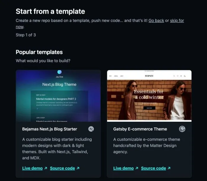
For the subset of users that do not have an existing project to import, Netlify offers a variety of templates to help users get up and running. This onboarding design reflects a clear understanding of their user base and new user journeys.
Steer users to the right "aha" at the right time
Let's say your app has three common "aha" moments. It might be challenging to balance all three at once. Instead of trying to force each one simultaneously, respond to the user intent. If you notice that a user is going down the path toward "aha" moment #2, then focus on getting the user to that moment.
For example you can have a product or a trigger after a specific behavior. Here's an example of one after you complete onboarding in Command AI.
Steer users at a time when you think they will be likely to respond well. When a user has recently dismissed a few modals or tooltips as soon as they appeared, it usually makes sense to allow for some time to pass before showing anything else.
Try multiple "aha" moments if one doesn’t stick
Sometimes a user has satisfied the conditions for one of your "aha" moments, but there was no change or improvement in their usage. The better your product is able to guide users to multiple "aha" moments, the more likely you are to retain users. User onboarding tools, such as a task checklist, can help
Help users who don’t seem to know what they want
If you look at enough product sessions, you'll find users that seem to be wandering aimlessly through your product. Ideally, this should not happen. Before users are even allowed to get to this state of affairs, they should be pushed to complete user onboarding flows that guide them to their "aha" moment. Sometimes you need to help users help themselves.
A simple checklist can be great for this!
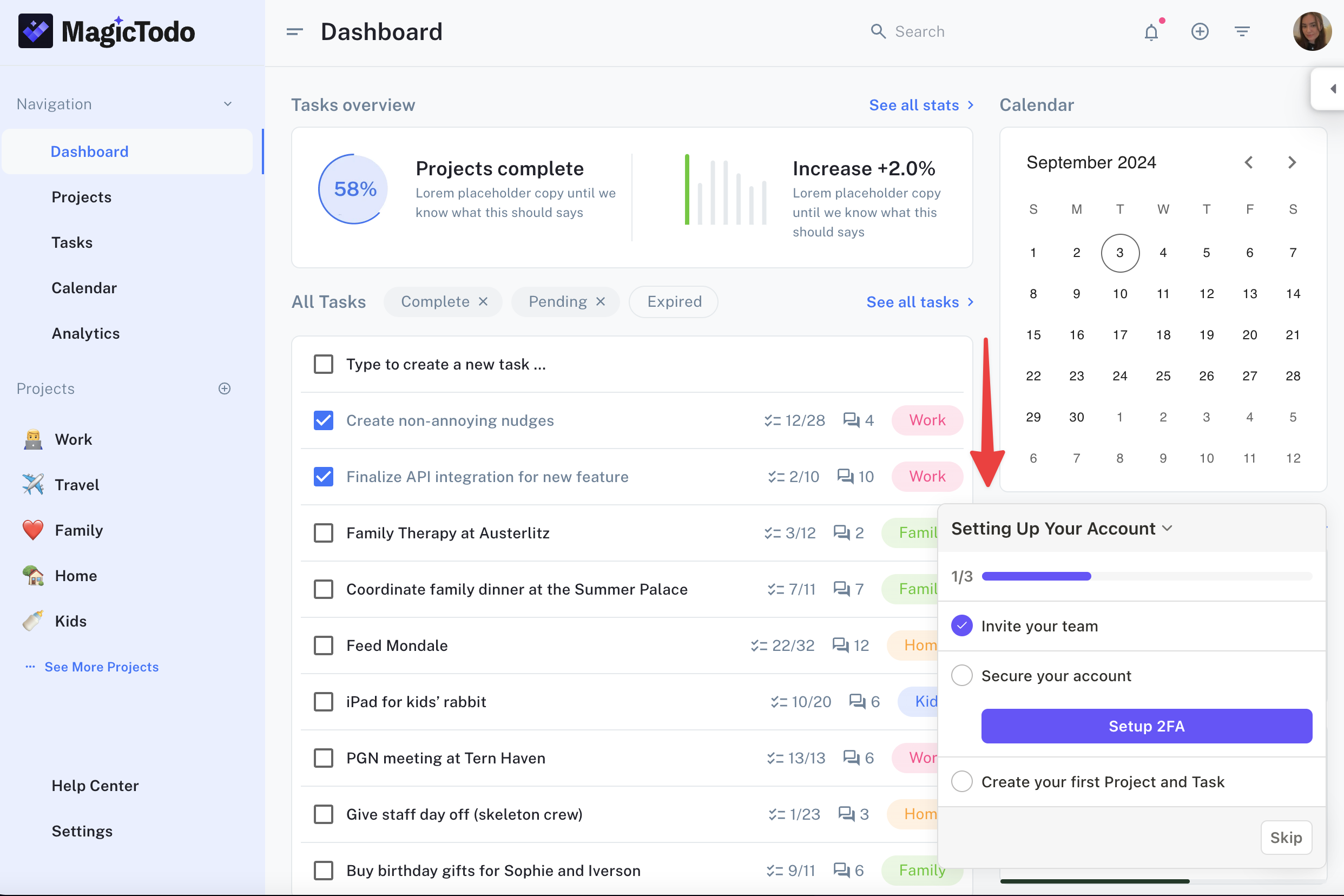
With a checklist, users can easily make progress but can do it at their own pace!
Wrapping up the "aha" moment
Understanding and identifying the "aha" moment(s) in your SaaS product is crucial to the success of your business. While it may be tempting to assume that any positive interaction with your product constitutes an "aha" moment, it is important to recognize that a true "aha" moment is one that leads to long-term user engagement and retention. By X-raying your app and product metrics, you can gain a better understanding of what drives user engagement and identify key features that lead to "aha" moments. Once you have identified these moments, it is important to build upon them by optimizing your product and marketing efforts to maximize their impact. Ultimately, by focusing on "aha" moments, you can create a product that users love, and that drives long-term growth for your business.
